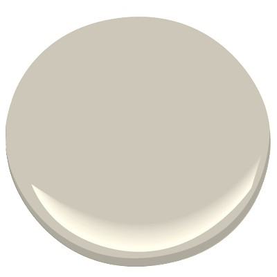
One of the most popular gray paint colors world wide; Benjamin Moore Revere Pewter is described by Benjamin Moore’s website as “A light gray with warm undertones, this classic shade creates a unifying look that calms and restores. A great transitional color, it’s perfect for an open floor plan.”
What is so great about Benjamin Moore Revere Pewter’s particular shade of gray?
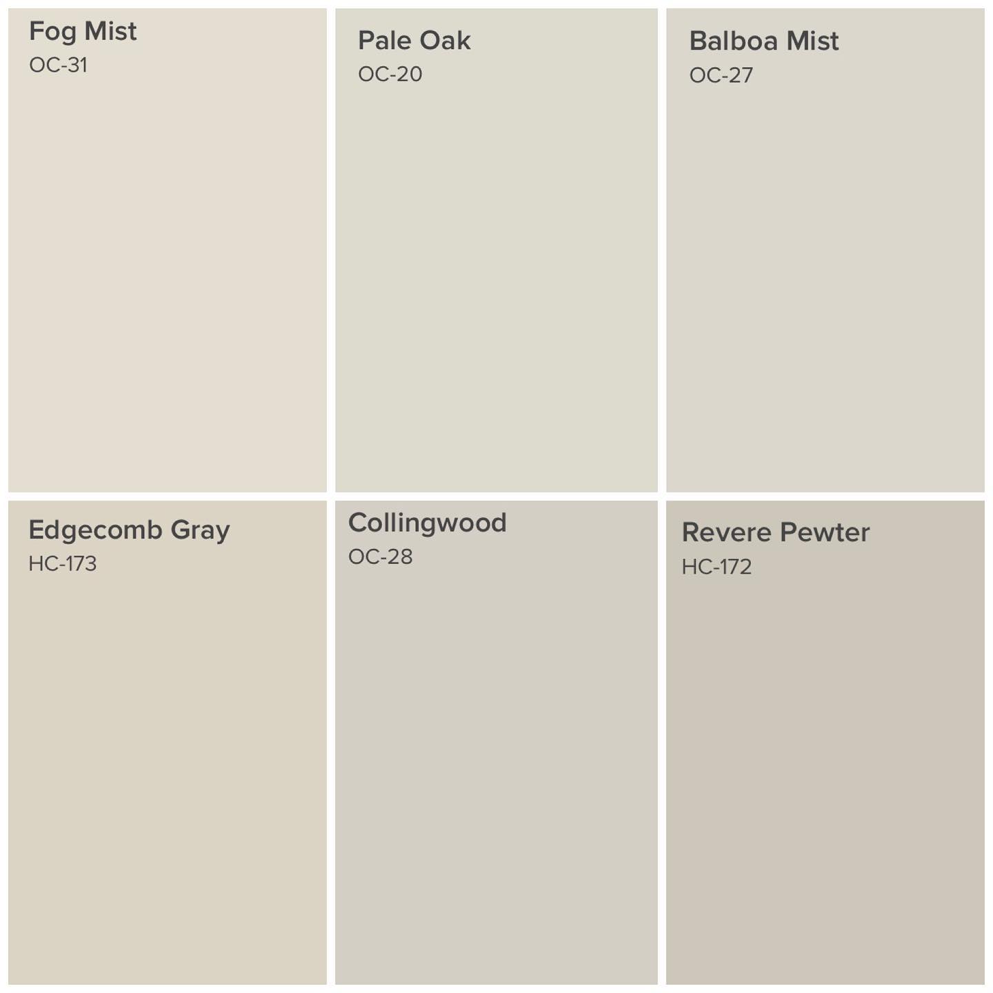
This paint color has a good depth, with light to medium reflective qualities, it is the perfect gray if you are looking for that griege to gray, warm yellow toned gray look (stay away from this color if a fresh and crisp gray is what you are after).
Sometimes described as a murky or muddy gray, this color is the perfect gray for a more relaxed, organic, welcoming and calming space. It’s a great solution for those who feel gray is too cold.
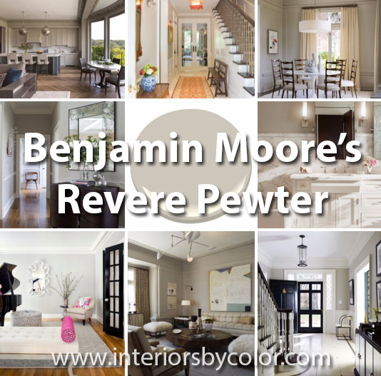
Color Analysis of Benjamin Moore Revere Pewter (HC-172)
Revere Pewter is a highly versatile, light-to-medium gray paint color known for its warm, welcoming, and calming nature. It bridges the gap between gray and beige (often called “greige”), making it a popular choice for those who find pure grays too cold or stark. Its adaptable nature allows it to feel both masculine and feminine depending on the surrounding elements.
Key Characteristics:
- Undertones: Predominantly warm yellow undertones, which contribute to its “greige” appearance and its ability to avoid feeling cold. Subtle green undertones can also be perceived, particularly when paired with certain colors like chartreuse.
- Reflectivity: Medium reflective qualities, meaning it doesn’t bounce light excessively, creating a more subdued and comfortable atmosphere. This is a key aspect to consider, as it influences how the color appears in different lighting conditions.
- Depth: Has good depth and a light to medium saturation, preventing it from looking washed out or flat.
- “Murky” or “Muddy” descriptor: This isn’t necessarily negative, but rather highlights its earthiness and organic quality. This is what gives it a relaxed and comfortable vibe.
- Transitional Color: Its neutrality allows it to blend well with various styles and design schemes. It is a great solution for those wanting to move away from stark white and incorporate subtle color into their living space.
Best Suited For:
- Relaxed and Comfortable Spaces: Ideal for creating a welcoming and inviting atmosphere in living rooms, bedrooms, and dining rooms.
- Open Floor Plans: Its unifying effect helps tie together different areas while maintaining a cohesive look.
- Homes with Natural Elements: Pairs beautifully with natural wood tones, stone, and other organic materials.
- Those Seeking Warmth: A great alternative to cooler grays for those who want a touch of warmth in their neutral palette.
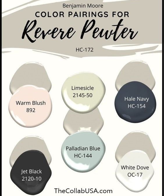
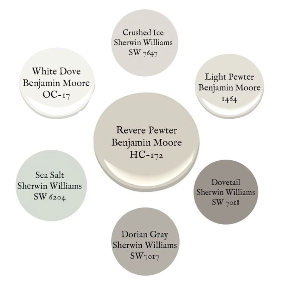
Color Pairings & Complementary Colors:
The analysis highlights Revere Pewter’s versatility by showcasing its success with a range of colors:
- White: (White Dove, White Chocolate) Creates a classic, clean contrast. White trim and ceilings enhance the warmth of Revere Pewter.
- Black: Adds sophistication and a modern edge, especially in minimal or transitional spaces.
- Yellow: Accentuates the warm undertones, creating a vintage or traditional feel. Works well in living rooms and other areas where a cozy atmosphere is desired.
- Pink: Creates a softer, more feminine, and glamorous look. Works in feminine spaces like bedrooms and living rooms.
- Warm Browns & Beiges: Creates a harmonious, earthy, and traditional palette.
- Orange: Adds a pop of vibrant warmth, especially in entryways or traditional spaces.
- Red: Creates a pop of color in combination with warm toned grays.
- Chartreuse: Draws out the subtle green undertones, resulting in a harmonious, organic feel.
- Blues: Creates a cooling effect, especially when used in art or accessories.
Potential Considerations:
- Lighting: Revere Pewter can shift in appearance depending on the lighting. In spaces with limited natural light, it might appear darker and more “murky.” In brighter spaces, it can look lighter and more reflective.
- Undertones: The warm yellow and subtle green undertones may clash with cooler color schemes. Consider this carefully if you prefer a cool-toned aesthetic.
- Crisp, Modern Look: If you’re aiming for a fresh, crisp, and modern gray, Revere Pewter might not be the best choice. Opt for cooler, more neutral grays instead.
Benjamin Moore Revere Pewter is a timeless and adaptable paint color that offers warmth and sophistication. Its “greige” nature and medium reflectivity make it a versatile choice for a variety of spaces, styles, and personal preferences. By carefully considering its undertones and lighting conditions, you can harness its full potential to create a beautiful and inviting home.
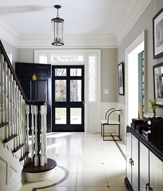
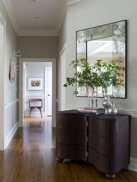
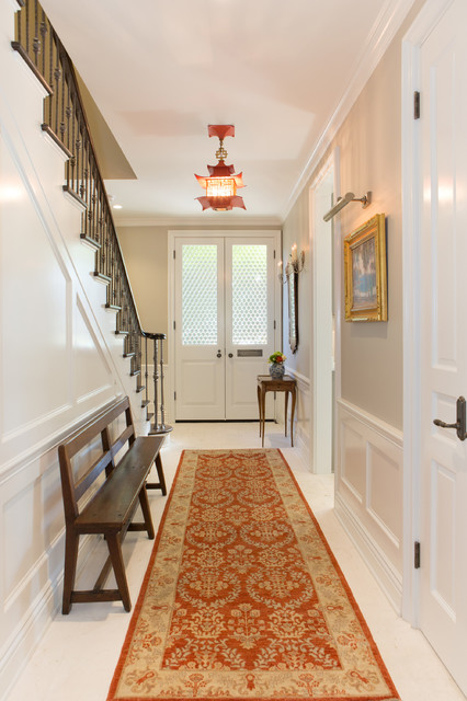
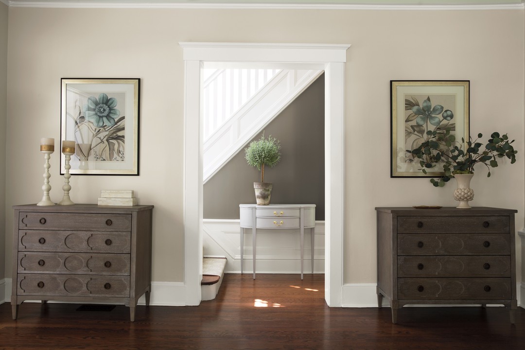
With White and Black
This entrance observes the minimal color and clean lines rule and shows off how great Benjamin Moore Revere Pewter looks when combined with white and black. It is a great color to add to a black and white space to give an added dimension without compromise. The white floors are Porto Beige limestone with Flannel Liner and Dot.
Love the black and white photographs, mirrored chest and antique chair by the front door.
Benjamin Moore Revere Pewter with Yellow
Johns Creek, Georgia based interior designer J. Hirsch combines Revere Pewter paint colored walls with warm browns, beige and yellow tones. The yellow curtains and yellow floor rug really helps bring out the warm yellow tones incorporated in this gray paint, it gives this traditional living space a vintage feel.
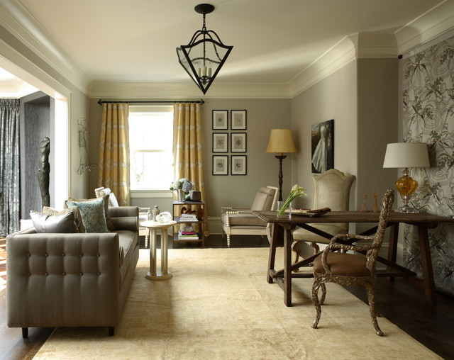
A traditional vintage charm with sepia tones combining Benjamin Moore Revere Pewter with warm wood tones and yellow.
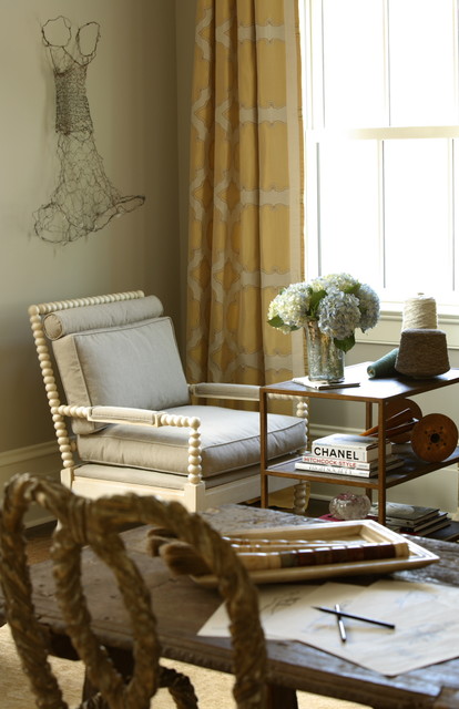
Revere Pewter walls look great with ceilings and trim in Benjamin Moore’s White Chocolate 2149-70.
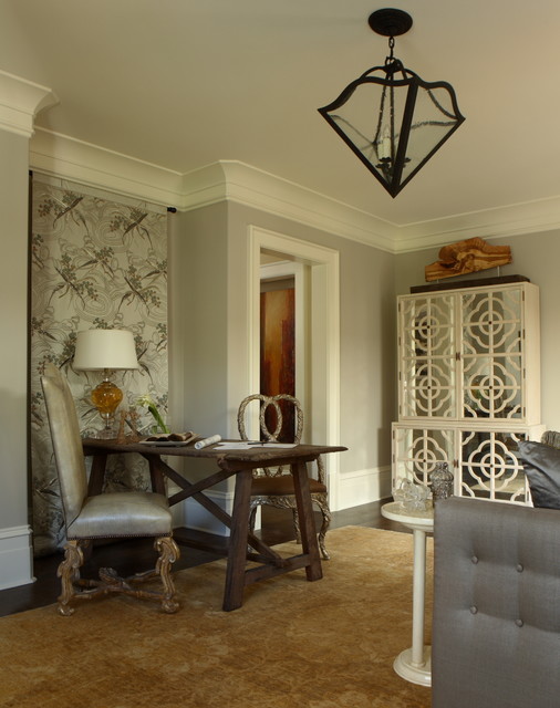
Los Angeles based architect Tim Barber also combines this shade of gray walls successfully with yellow. Love the diagonal structure of the gallery wall, white shag carpet, brown sofa and yellow chairs. Revere Pewter decidedly takes on a darker, more imposing shade of gray in this transitional living room.
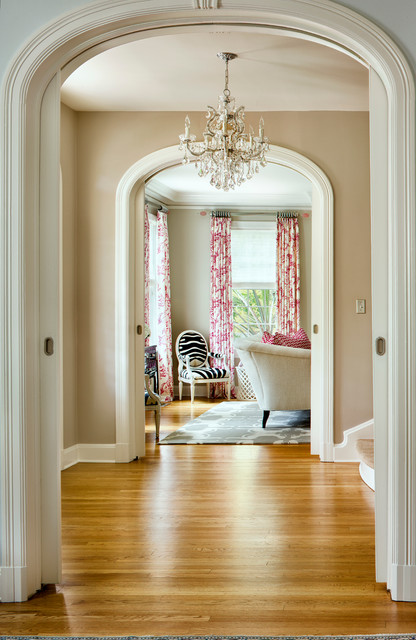
Revere Pewter with Pink
Minneapolis, Minnesota based interior designer Martha O’Hara seamlessly combines walls painted in Benjamin Moore’s Revere Pewter with ceiling and trim in Benjamin Moore’s White Dove and hot pink, glamorous accents. So here we can see the versatility of Revere Pewter to move from a masculine space as seen in some of the other living spaces to a fresh and glamorous feminine space when in combination with white and pink.
Revere Pewter takes a lighter, more reflective incarnation in this space.
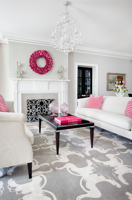
Love the pink and white print drapes and pillows, damask gray and white rug and glam zebra striped chair.
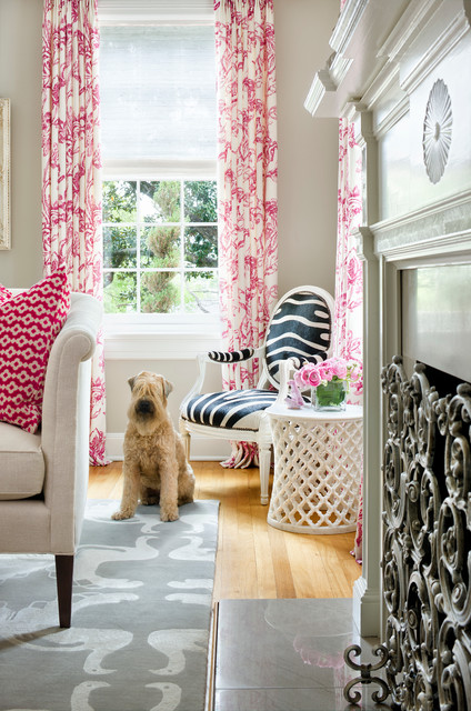
The warm timber floors helps bring out Revere Pewter’s warmer tones.
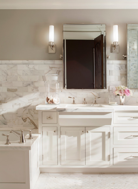
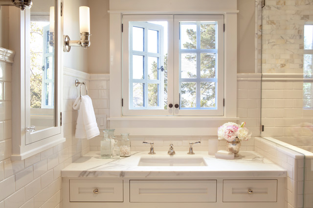
Revere Pewter and White Dove
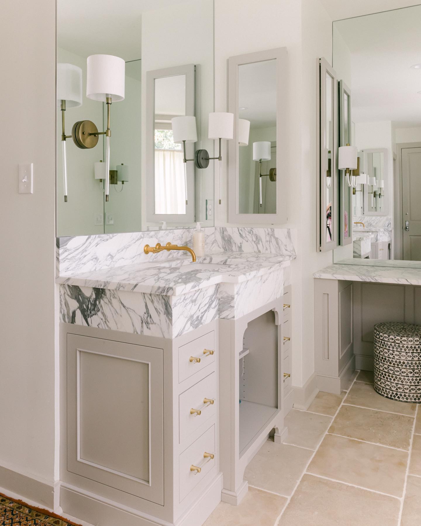
This soft gray with beige undertones is the perfect complement to most white marbles, such as Calacatta. This elegant bathroom is painted in Benjamin Moore’s Revere Pewter HC-172 with the cabinets painted in Benjamin Moore’s White Dove OC-17. bathroom design by San Francisco based Scavullo Design Interiors.
Other Great Spaces Painted in Benjamin Moore’s Revere Pewter
An entrance that combines warm gray walls with great lighting, hardwood floors and warm inviting furniture by S. B. Long Interiors.
The chartreuse armchairs and red rug bring out the murky green tones in Revere Pewter, walls and trim are painted in White Dove. By Rasmussen/Su Architects.
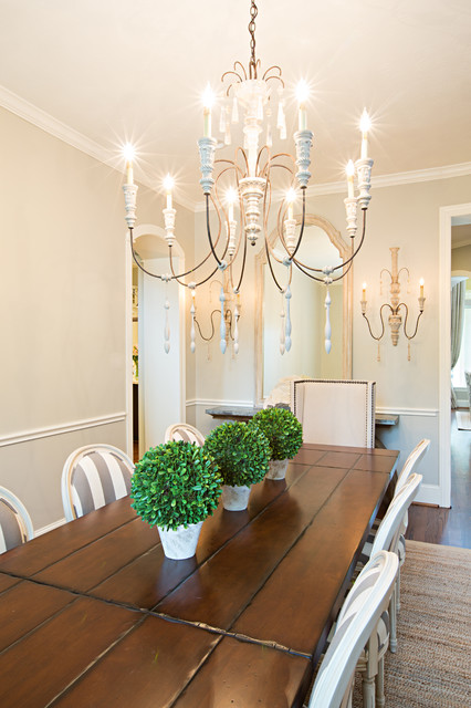
Traditional dining room with white and gray striped chair, wooden floorboards, and large chandelier. Amanda Carol Interiors.
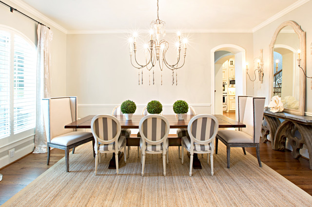
Love the chandeliers and green center pieces.
Revere Pewter walls with molding and ceiling in Deep in Thought. Love the noticeable large piece of canvas, the blues in it helps to cool down this gray paint. Leverone Design, Inc.

Love the contrast between the beige drapes and the white of the rug and chairs.
Charmean Neithart Interiors combines Revere Pewter with warm wood tones and orange accents in this traditional entryway.
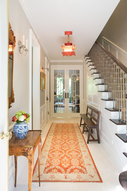
Love the orange runner.
John K. Anderson Design creates a wonderful greige transitional kitchen/dining/living area with cabinetry color in Benjamin Moore Revere Pewter in a Satin finish. The Island is Benjamin Moore Down Pipe also Satin.
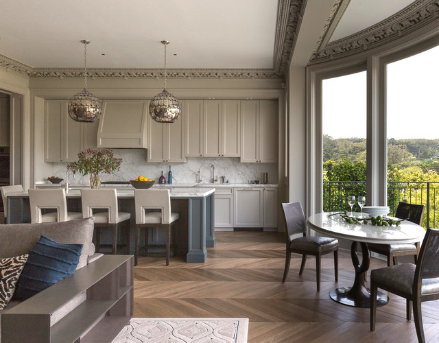
Loving the lights and the detailed crown molding in this kitchen.
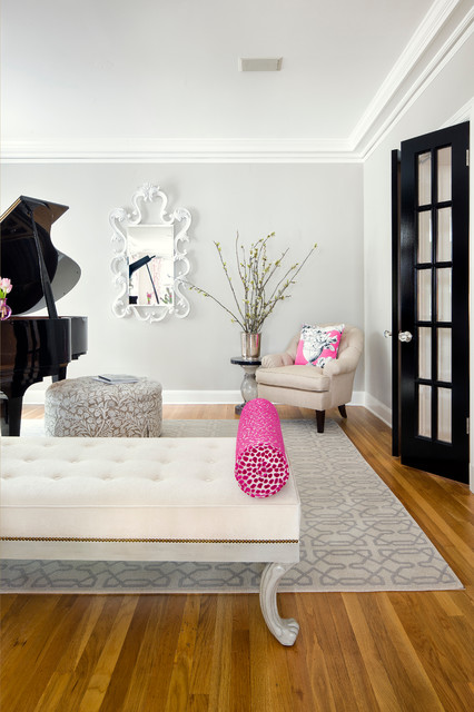
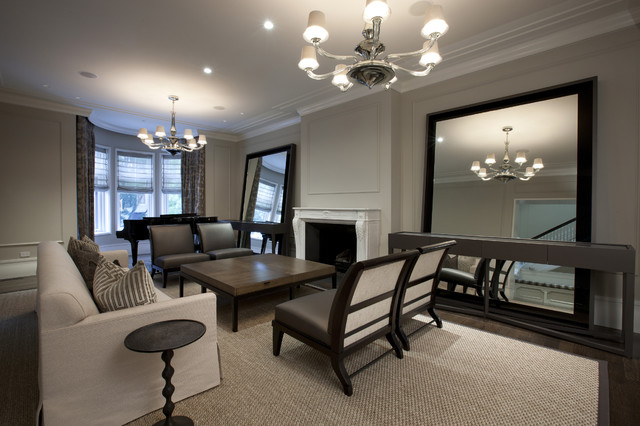
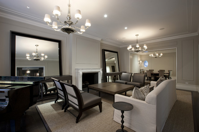
Chicago, Illinois based Interior designer Michael Abrams creates this masculine living space combining Revere Pewter walls with Vanilla Milkshake for the ceiling and trim and furnishings and accents in dark wood and black tones. Love the grand piano and two large floor mirrors flanking the fireplace and the sisal floor covering bound in leather that pops off the espresso floor.
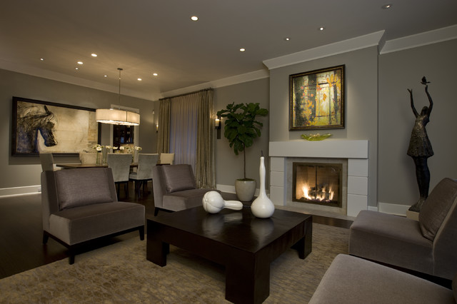
A transitional living/dining room with walls painted in Revere Pewter HC-172 Paint with great balance, lovely clean furnishings, in this image you can see the more murky nature of Revere Pewter coming through, creating a more intimate space.
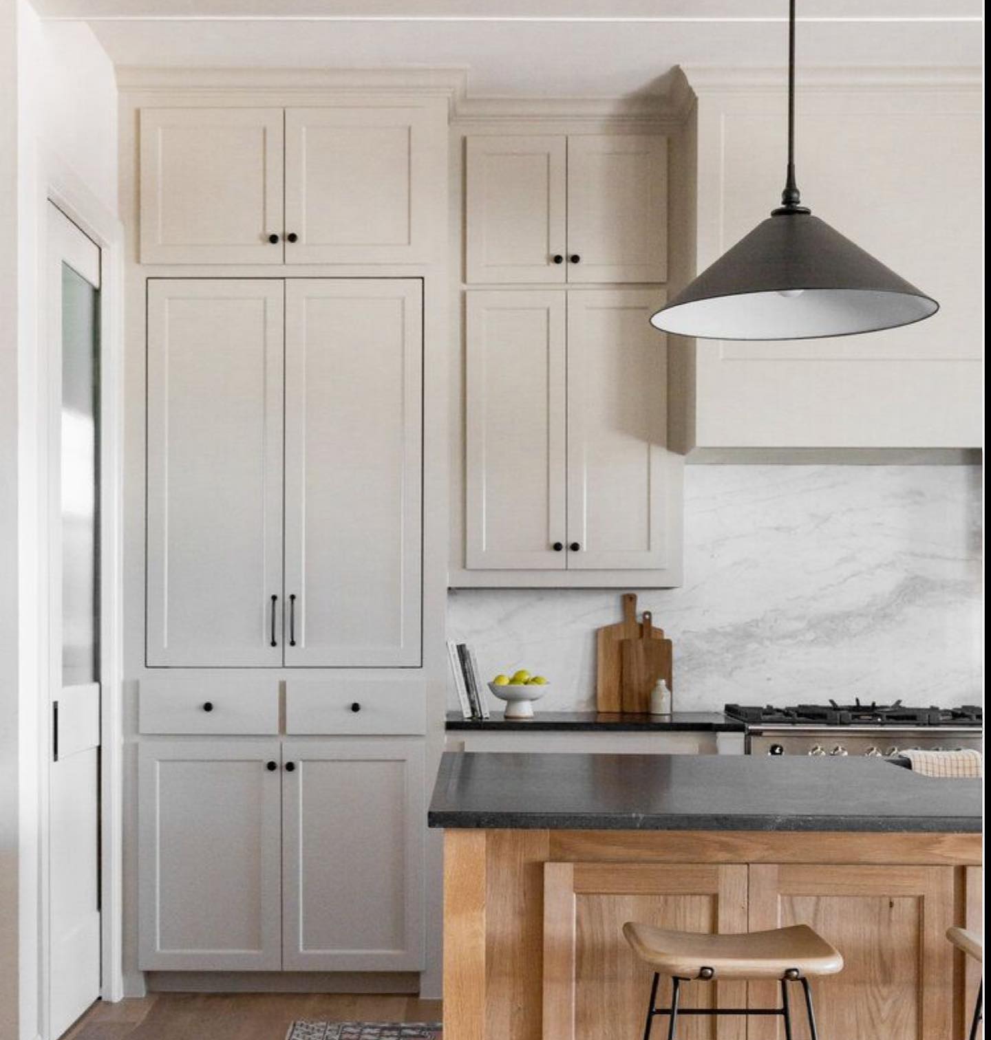
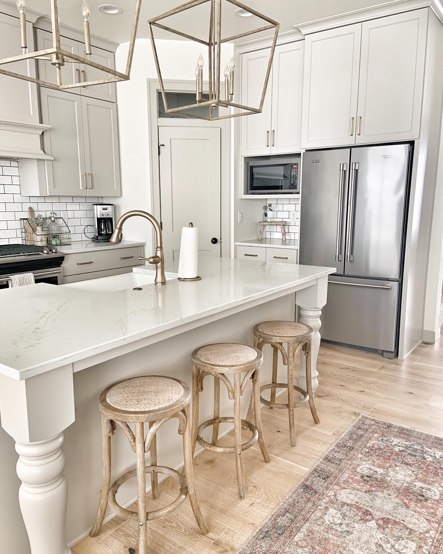
This paint color combines perfectly with white in this kitchen and gives a natural stone feel to the kitchen cabinets.
This paint color is the go to for a farmhouse kitchen. Via vintage_wisconsin.
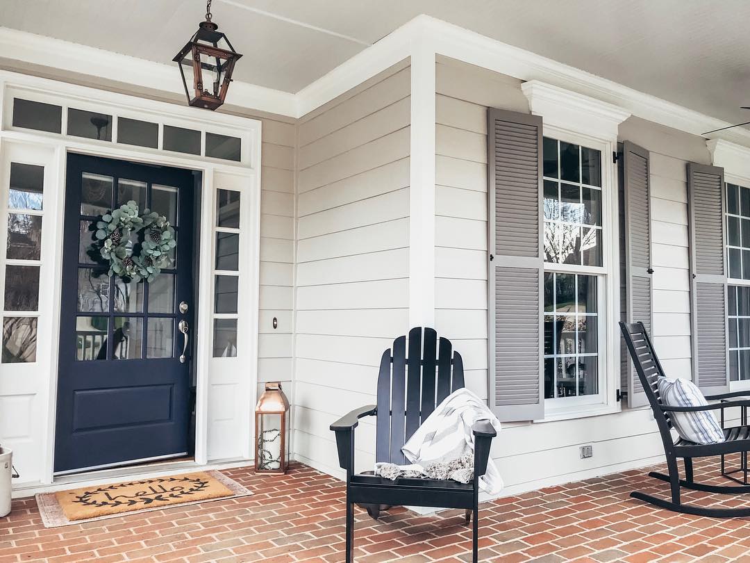
“Our front door color has been getting a lot of love lately! It’s Charcoal Blue in Satin by @sherwinwilliams and pairs nicely with BM Revere Pewter siding, BM Graystone shutters, SW Pearly White trim, and SW Misty ceiling.” Via houseofbluehues.
To make a great first impression, you need a paint that does the same. Excellent hide and coverage for a uniform finish, Regal® Select Interior is ideal for any transformation in your home.
Near wall color: Revere Pewter HC172, Regal® Select, Eggshell
Far wall color: Chelsea Gray HC168, Regal® Select, Eggshell
Trim: Decorators White, ADVANCE®, Semi-Gloss
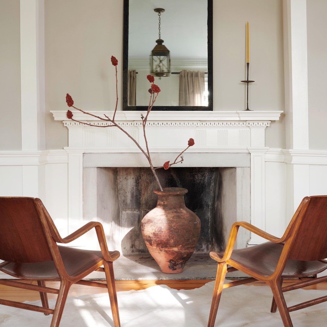
One person’s fireplace is another person’s coffee table! Tell us about the quirkiest spot in your home and which paint colors you use to draw attention to it.
(WALL) Revere Pewter HC-172, Aura®, Matte (TRIM) Simply White OC 117, ADVANCE®, Satin (MANTLE) Simply White OC-117, ADVANCE®, Satin
Paint colors in this soothing room via sosimplyjessica.
White Walls: Sherwin Williams, Pure White
Trim & Doors: Benjamin Moore, Revere Pewter
Fireplace Surround: Benjamin Moore, Revere Pewter
Revere Pewter never looked so good! Bathroom via millvalleykitchens.
Walls make a house but it’s the details that make a home!! I think about this all the time, if you have a cookie cutter home that’s ok! Give it some character and make it your own. Via evelyn.interiors.
Walls: White Dove and Revere Pewter Benjamin Moore.
“Revere Pewter from @benjaminmoore is still one of my favorite paint colors!
This color is a warm gray with a green undertone that can even look taupe at times! In this room it really takes in the gray color.” via kellyapaulson
“One of our trusty favourites – Revere Pewter by Benjamin Moore!! 👏🏼 We love it featured here on this back door and surrounding wainscotting” 2galspropainting
See More Popular Paint Colors
See another on trend gray paint color: Benjamin Moore Kendall Charcoal
Color Combos and Palettes
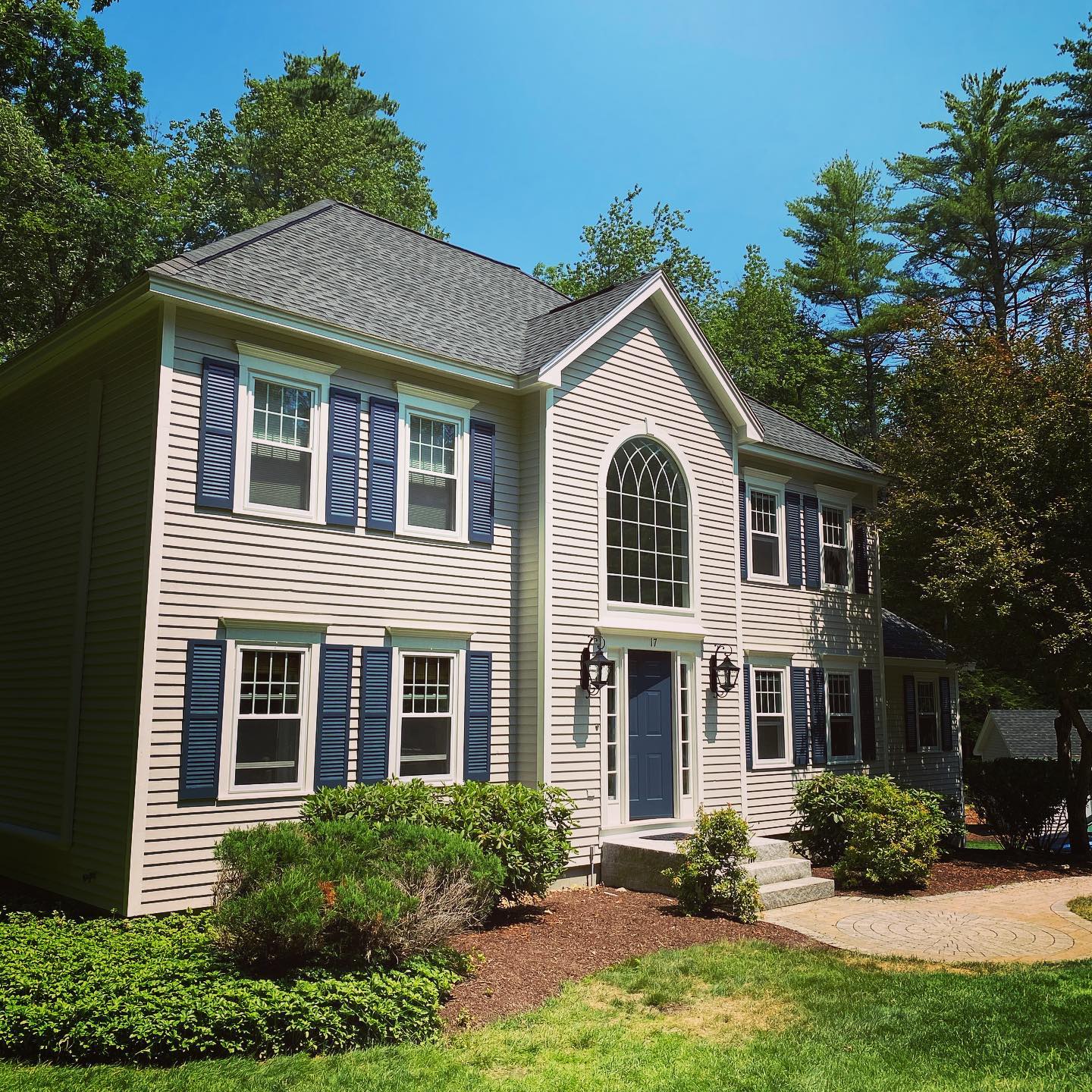
Benjamin Moore Revere Pewter house paint exterior
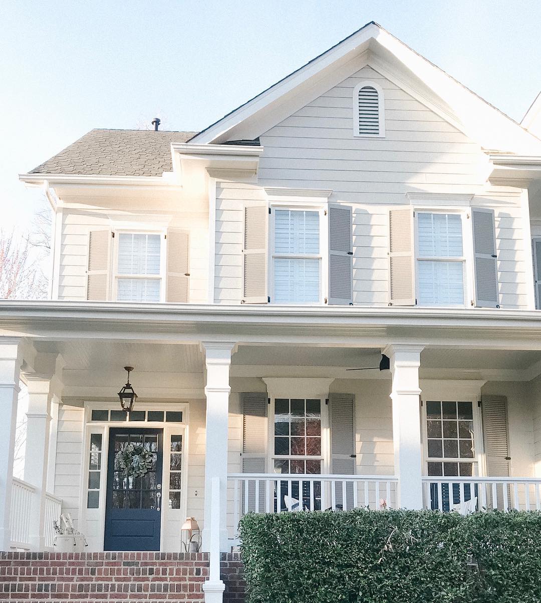
“Finished up this exterior today! Siding is Benjamin Moore Revere Pewter, trim in White Dove, and shutters and door in Hale Navy!” via proimage
“I will forever be a fan of Benjamin Moore Revere Pewter. ⠀⠀⠀⠀⠀⠀⠀⠀⠀
⠀⠀⠀⠀⠀⠀⠀⠀⠀
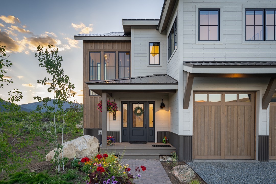
YES I have a LOT of go-to colors in my back pocket but this is one of my all times faves. It just looks SO good in our Colorado sunlight! Here, we decided to put it on the exterior siding and though it looks different than what we’re accustomed to it looking like inside, it’s still a slam dunk! ⠀⠀⠀⠀⠀⠀⠀⠀⠀
⠀⠀⠀⠀⠀⠀⠀⠀⠀
When you find certain colors that work for your climate, you can replicate the feels again and again and it just works! Looking for a beautiful greige that creates the warm and fuzzies, yet feels sophisticated and rich? Revere Pewter FTW!” via somrakinteriors
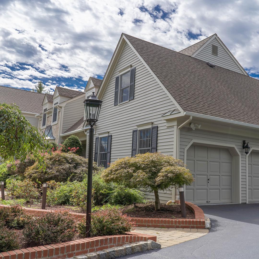
“Amazed at how great this exterior painting job came out. Love the colors combination used from @benjaminmoore historic collection to create this clean classic look. Via andres_o_
Siding: Revere Pewter HC-172
Trim: Rockport Gray HC-105
And Black Shutters”
Just bought a house with all Pewter Grey walls. Not sure if it is grey or linen color. I am trying to match the window treatments and rug in the living room area and not sure what color I should be looking at. My furniture is dark burgundy. Could you lead me in the right direction?
I just bought a new comforter with wedge wood blue, grays and while my furniture is darker oak and rug on beige side And blinds beige tone . Would revere pewter look ok or natural linen better ?