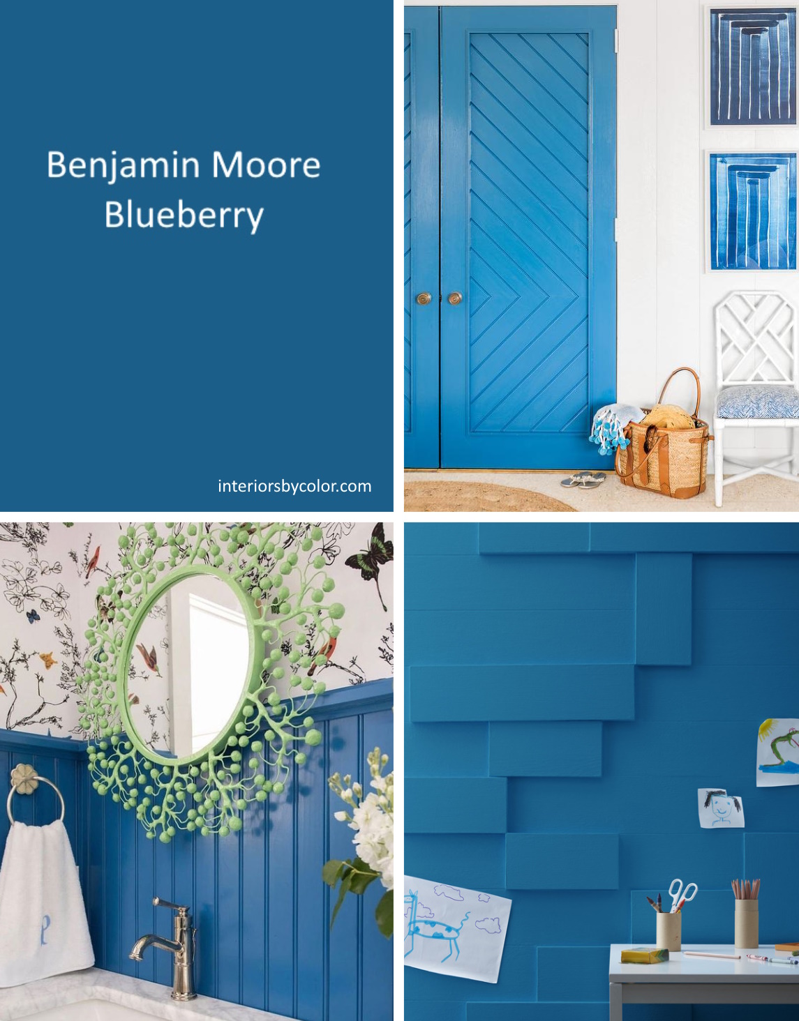
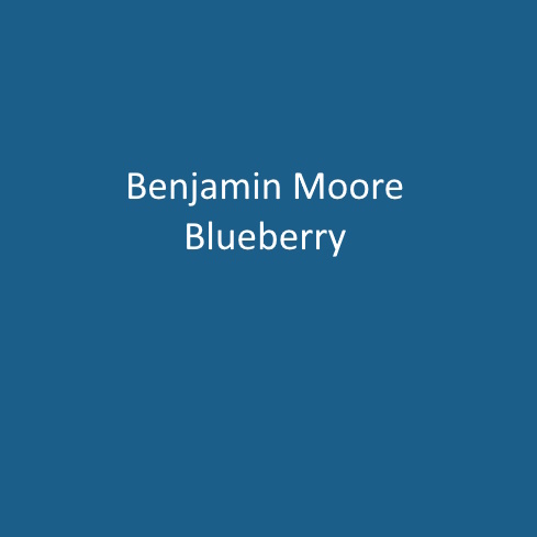
Benjamin Moore Blueberry. A classic blue with a comforting yet energetic presence.
Oh, Benjamin Moore’s “Blueberry” is such a delightful choice! It’s like that perfect shade of blue you see in a carton of ripe blueberries – deep, vibrant, and full of life. Imagine walking into a room painted in “Blueberry”; it’s as if you’ve just wrapped the space in a cozy, yet invigorating, blanket of color.
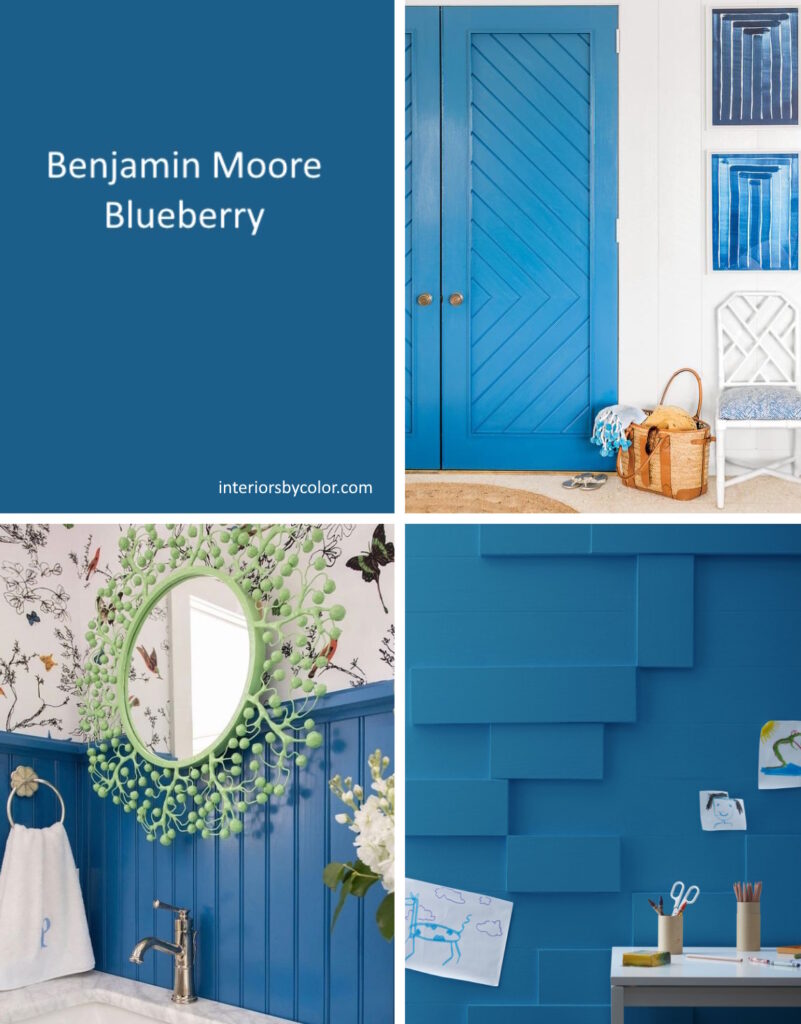
A classic blue paint color, perfect for someone looking for a true blue with a vibrant energy. This color has a way of adding a rich layer of sophistication to any space without feeling overwhelming. It’s bold, yes, but it carries this elegance that makes it incredibly versatile. Whether you’re thinking about creating a statement wall in your living room or dreaming up a cozy, chic bedroom, “Blueberry” brings a depth that’s hard to match. It pairs beautifully with crisp whites or soft grays, allowing those lighter tones to pop and give the room a fresh, airy feel.
What I adore about “Blueberry” is its ability to transform a space not just visually but emotionally. It has this unique quality of being both energizing and soothing at the same time. Imagine curling up with a book in a “Blueberry” room as the afternoon sun filters in, or entertaining friends in a dining room painted in this gorgeous hue – it sets the perfect backdrop for making memories.
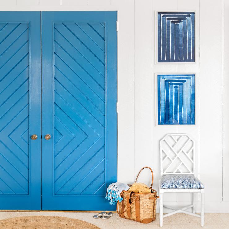
This chevron patterned door is painted in Benjamin Moore Blueberry. By Meg Braff Interiors.
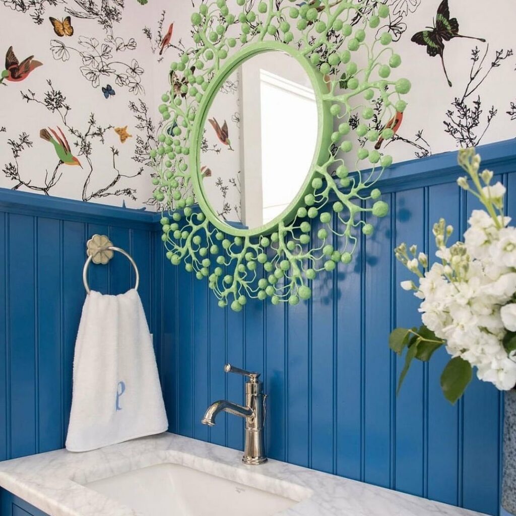
The wall paneling of this stylish bathroom is painted in BM’s Blueberry. Via ostervillehardware.
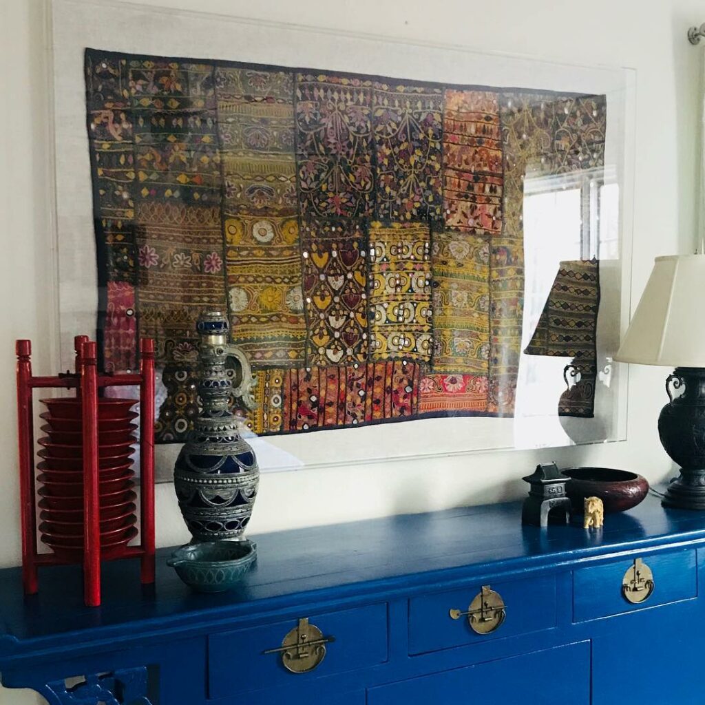
And let’s talk about accents – because “Blueberry” loves them. Gold or brass hardware? Stunning. Natural wood tones? They become even warmer. It’s a color that plays well with light, changing subtly from morning to evening, always keeping you guessing and never boring. This vibrant blue paint color is fantastic for painted furniture. Via TATEstudio.
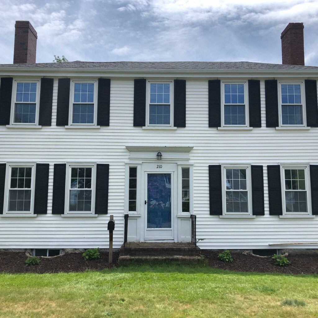
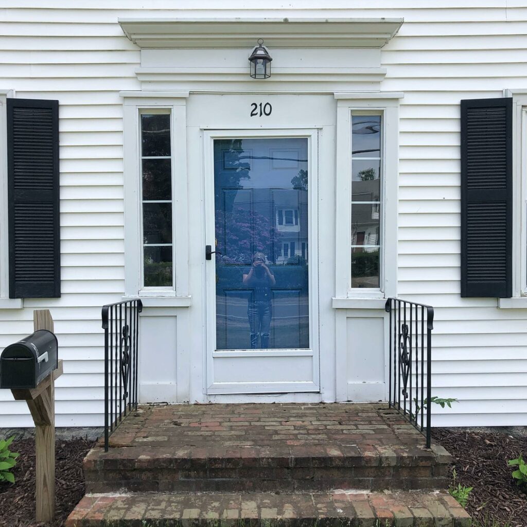
The front exterior door of this historic federalist home is painted in Blueberry by Benjamin Moore. Via thebrigdenhouse.
Choosing “Blueberry” is like saying, “Yes, I want my space to feel both inviting and stylish.” It’s a commitment to color that pays off in spades, offering a blend of warmth, depth, and style that few other colors can. So, if you’re looking to add a touch of drama without sacrificing coziness, “Blueberry” might just be your new best friend in the color spectrum.
Related: Blue Paint Colors
Similar Blue Paint Colors to Benjamin Moore Blueberry
Let’s explore some blue paint colors that share the same deep and sophisticated vibe as Benjamin Moore’s “Blueberry,” without getting too abstract in our descriptions. These hues are perfect for bringing that rich and inviting atmosphere into your space:
1. Sherwin-Williams Naval (SW 6244)
Naval by Sherwin-Williams is an excellent choice if you’re looking for a deep, sea-inspired blue that’s both bold and serene. It offers a touch of maritime elegance and pairs wonderfully with neutrals and wood accents for a grounded, yet expansive feel.
2. Farrow & Ball Hague Blue (No. 30)
Hague Blue from Farrow & Ball is rich and luxurious, with green undertones that add an incredible layer of richness to rooms. It can look almost black in certain lights, making it a great option for creating sophisticated, moody interiors that are still welcoming.
3. Benjamin Moore Newburyport Blue (HC-155)
Newburyport Blue, also by Benjamin Moore, is a bit lighter than “Blueberry” but still offers a lot of depth and energy. It’s an excellent choice for areas where you want a bit of sophistication without the color being too overpowering. It shines in well-lit rooms, adding a refined yet vibrant touch.
4. Behr Starless Night (PPU14-20)
Starless Night by Behr is a bold and expressive blue. Its intensity is similar to “Blueberry,” making it a standout choice for feature walls or furniture pieces. It’s the kind of color that grabs attention, perfect for making a statement.
5. Dulux Oxford Blue
Oxford Blue from Dulux is a traditional blue with a timeless appeal. It’s a shade brighter than “Blueberry” but still carries a significant amount of sophistication. It’s incredibly versatile, fitting well in both modern and classic interiors, and it complements a wide range of decorating styles.
6. Behr Starless Night (PPU14-20)
This color is a deep, saturated blue that could serve as a similar alternative to “Blueberry,” matching its intensity and depth.
7. Farrow & Ball Drawing Room Blue (No. 253)
This is a deep, rich blue that carries a similar level of sophistication and depth as “Blueberry,” making it a great alternative option.
These colors are fantastic alternatives to “Blueberry,” each bringing their own unique flavor but maintaining that rich, inviting blue that makes a space feel special. When deciding, think about the lighting in your room and the overall atmosphere you want to create. Testing the colors in your own space with samples can help you see which one matches your vision best. Whether you’re aiming for a cozy vibe or a bold statement, one of these blues could be the perfect match.
