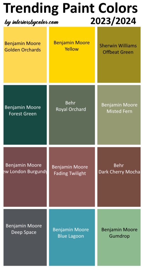
Trending for 2023-24 is a palette that’s all about combining a refreshing blend of classic elegance and vibrant energy. Following is a striking mix of trending paint colors that cater to diverse tastes and moods.
Trending Yellow Paint Colors
For those craving a burst of positivity and energy, bright yellows are stealing the spotlight in 2023. These cheerful shades can instantly uplift a space, making them ideal for accents in your living room, kitchens, home offices, or any area where creativity and vibrancy are encouraged.
Benjamin Moore Golden Orchards – A deep yellow with sharp orange undertones.
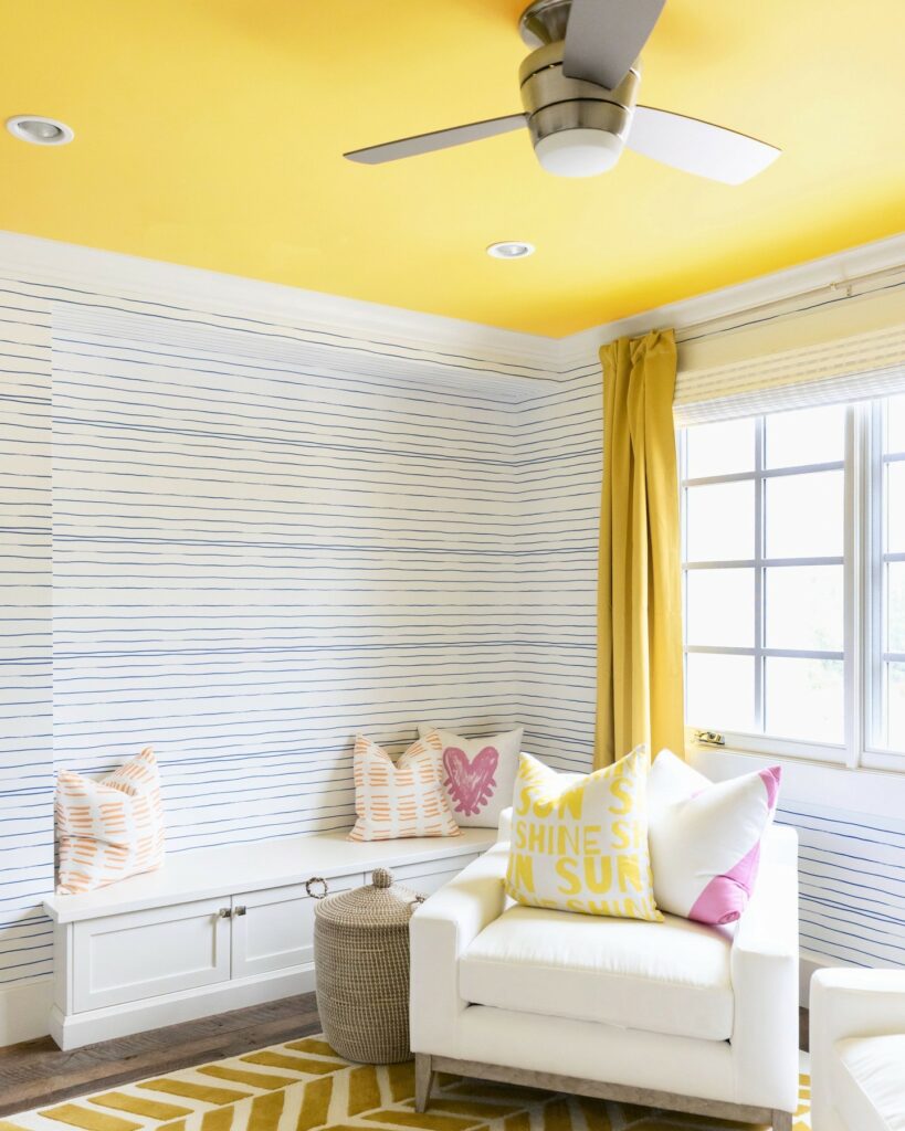
Bring sunshine into your home with Benjamin Moore Golden Orchards by painting your ceiling in this bright yellow paint color. Via designer @kimberleykayinteriors.
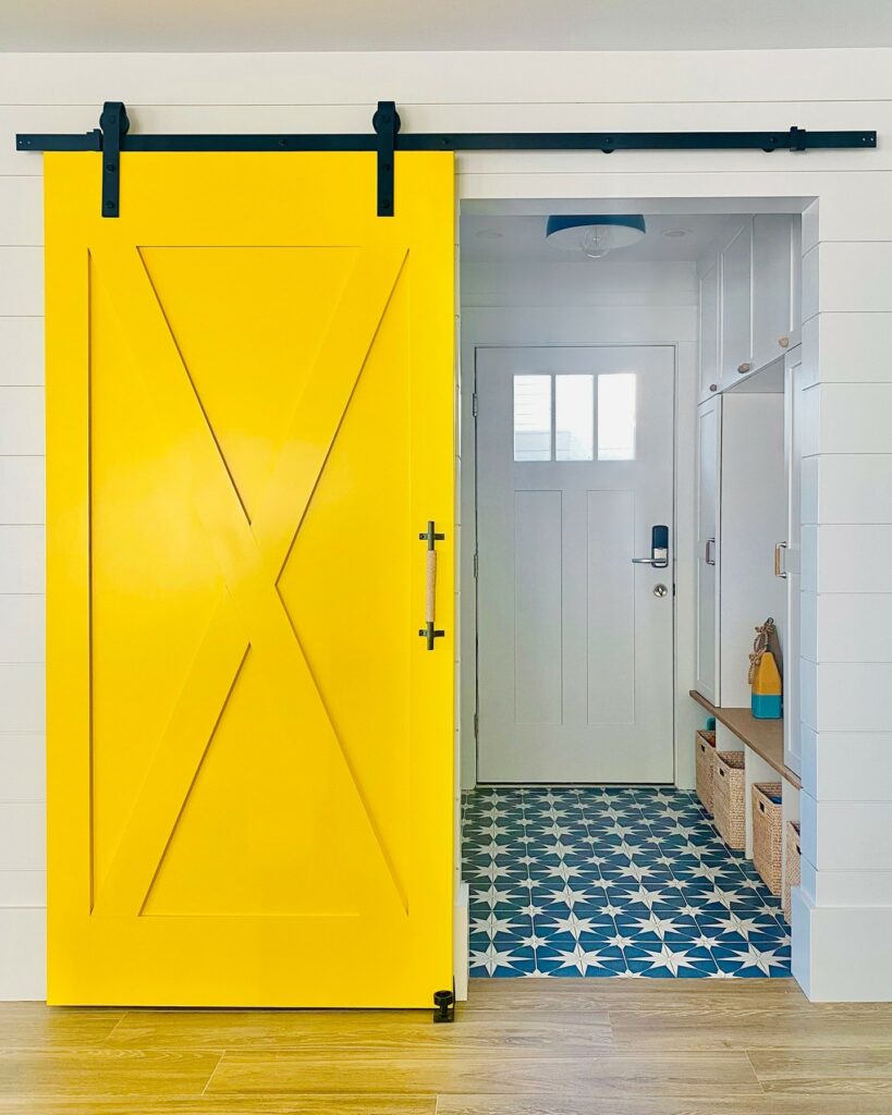
Benjamin Moore Yellow – Part of a collection of bold, saturated colors that brings spaces to life for those looking to illuminate their world with pure, extraordinary color.
“When you’re picking out a yellow, the options seem infinite! We went with the most classic shade,” say designers Amanda Moore and Keri Venti.
HGTV
Trending Green Paint Colors
Natural green tones are making a comeback, reflecting our growing desire for sustainability and connection with nature. From earthy greens to muted olive shades, these colors bring the outdoors in, creating a soothing environment that promotes well-being
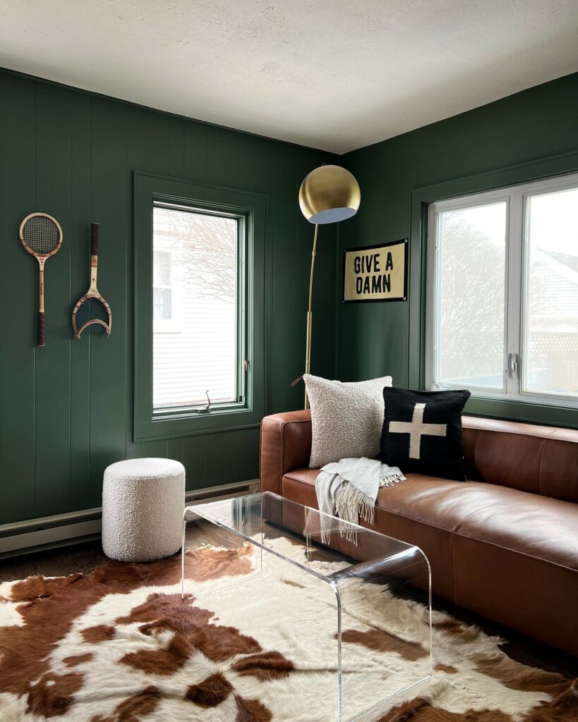
Behr Royal Orchard – a dark and deep olive green.
“For my husband’s home office, I wanted a color that would feel sophisticated but not stuffy,” says designer @csnowak. “He works in sports, with a focus on tennis and baseball, which inspired the supersaturated green walls and the leather sofa.” (Royal Orchard by Behr)
HGTV
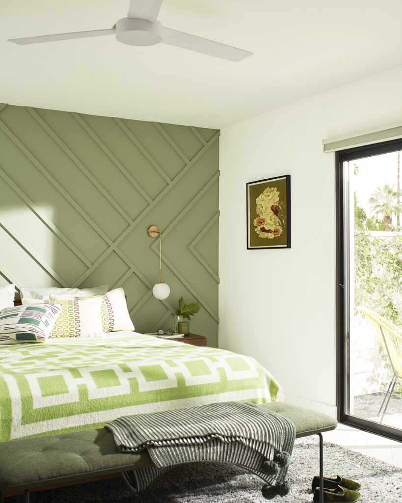
Benjamin Moore Misted Fern – A lush, warm green that brings to mind an elegant, plant-filled veranda.
Looking for an easy way to spruce up your bedroom? Add definition and dimension with a paneled accent wall. Balance a mossy green like Misted Fern CC-668 with soft Cloud White OC-130 to create a colorful space without feeling overly saturated.
Benjamin Moore
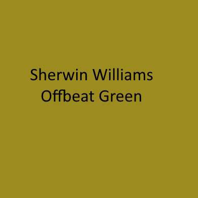
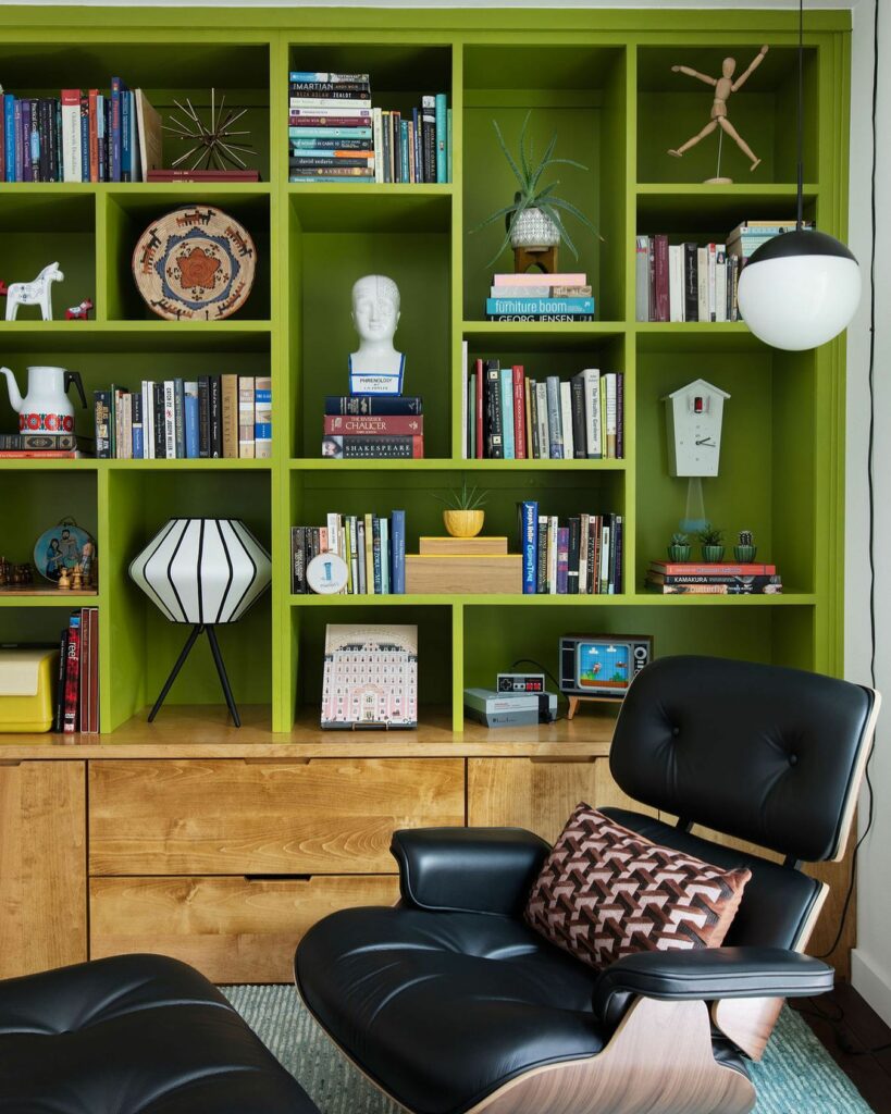
Sherwin Williams Offbeat Green – A bright green with yellow undertones.
When we dive into a design, one of the first steps is laying out a proposed floor plan. This is the moment when we “solve” every space by giving it a purpose that meets our clients’ specific needs and lifestyle. For this previously-empty corner of our clients’ open floor plan, we designed a built-in library, outfitted with a reading light and the perfect chair for cracking open a book. To anchor the space, we bathed it in the most satisfying green our clients say is the perfect combination of cute and ugly: “cugly” green! 😆💚 We love toeing that line between weird and fantastic, for unexpected moments that delight.
heynowinteriors
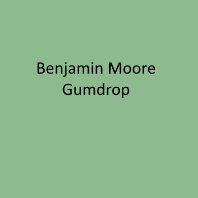
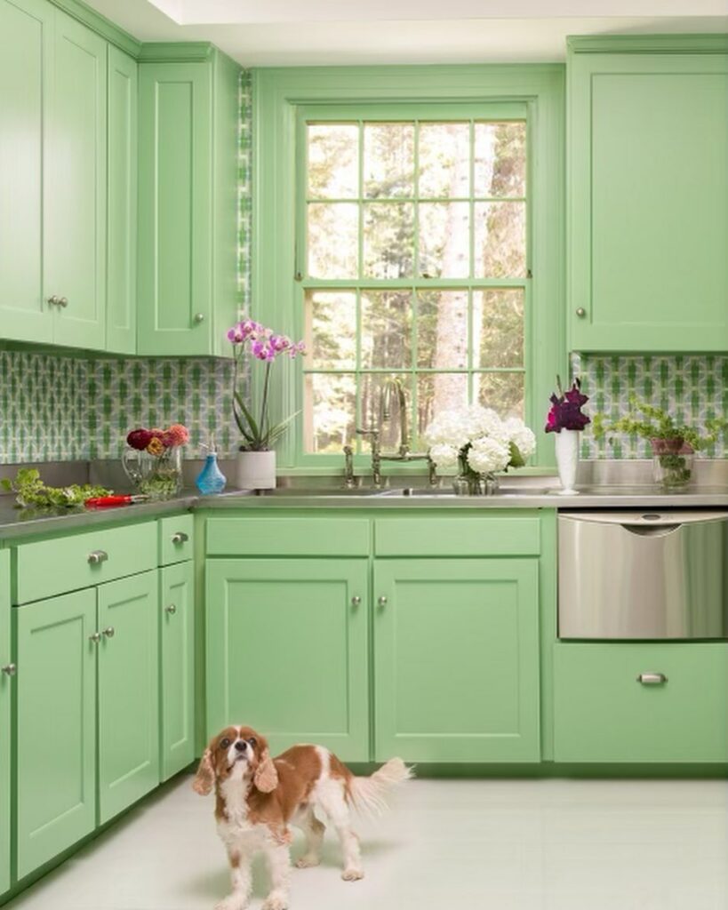
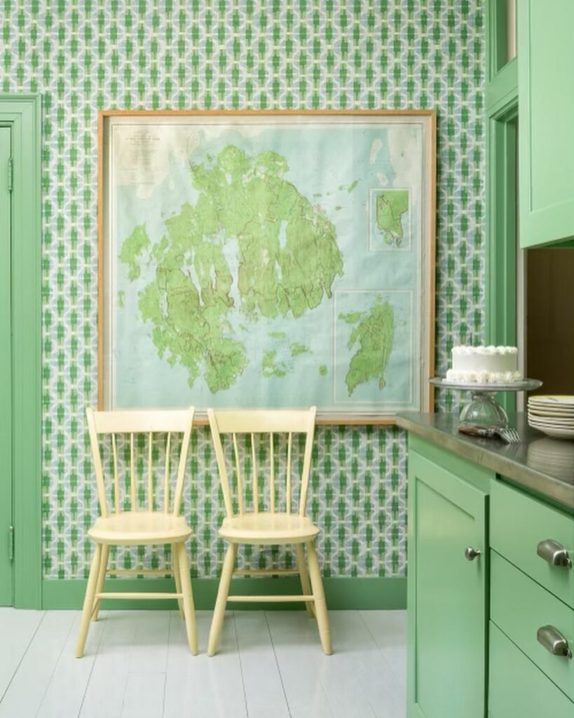
Benjamin Moore Gumdrop – A sweet, spirited green reminiscent of apple-flavored candy.
This playful and charming pantry located on Mount Desert Island! ✨We were requested to use my client’s favorite color, green, and we did just that. By taking a fabric pattern from @galbraithandpaul and making it into a wallpaper, which we custom colored, we achieved this goal. The cheerful cabinetry is painted in Benjamin Moore’s “Gumdrop” green, and the countertop surfaces and sink were replaced with stainless steel material. Also, we can’t forget this vintage MDI map for the finishing touch.
@leandrafsinteriors.
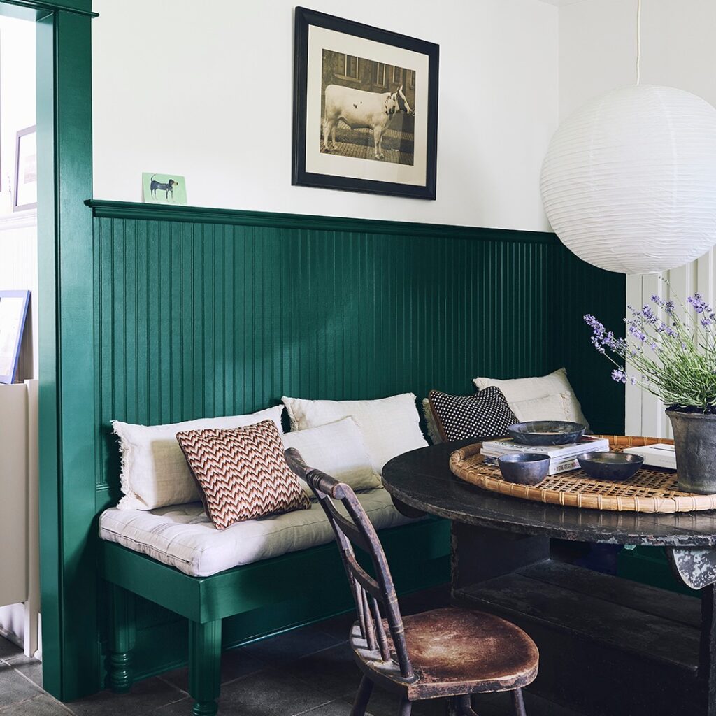
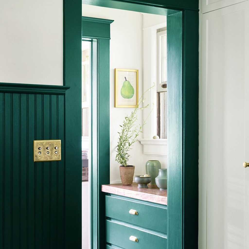
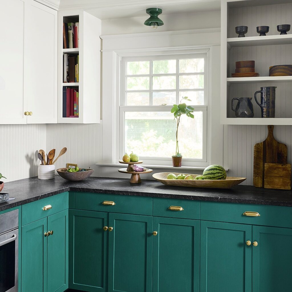
Benjamin Moore Forest Green – An enchanting dark green with a grounding yet sophisticated presence.
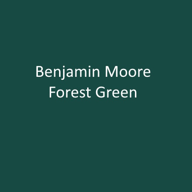
This deep green paint color looks great combined with White Heron on the walls and ceiling.
Forest Green 2047-10 can make any space feel enchanted, but especially so when painted on wainscoting or cabinetry for a defined pop of color.
Benjamin Moore
Trending Teal Paint Colors
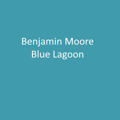
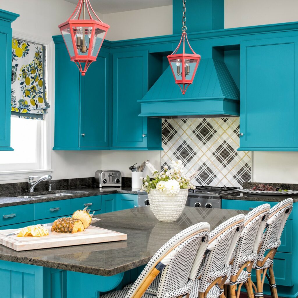
Benjamin Moore Blue Lagoon – A unique blue that pops with teal undertones.
This bright, bold and cheerful kitchen has cabinets painted in Blue Lagoon by BM. Via designer @leandrafsinteriors.
Red and Burgundy Paint Colors
Burgundy, a deep and rich hue, gives off a sense of sophistication and warmth, making it an excellent choice for accent walls or cozy, intimate spaces. Pair it with neutral tones like soft grays or creams to create a harmonious and inviting atmosphere.
Sherwin Williams Radicchio Leaf

My “favorite” room is usually the one we’ve just transformed, but as the house feels more finished, the library is the one I always come back to. The one I want to spend the most time in. It’s strong and opinionated, not for everyone, but I appreciate its boldness. Within that strength is comfort. It just feels good to be enveloped by the mauve and raspberry. And everything looks good in it, like this new painting I picked up today.
@themakerista
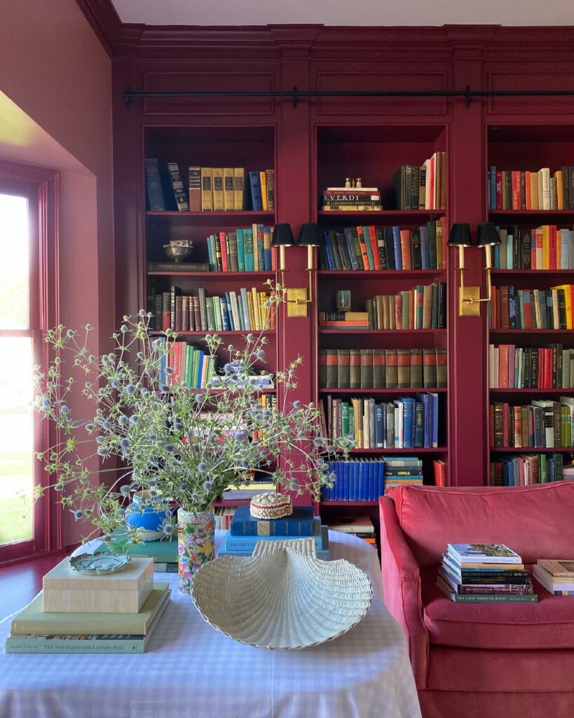
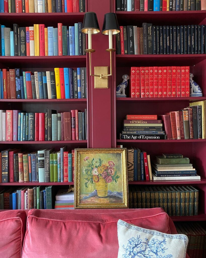
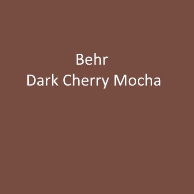
Behr Dark Cherry Mocha – Dark Cherry Mocha is as decadent as it gets with its mix of chocolate, coffee and spiced red.
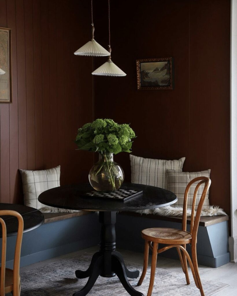
A warm and inviting breakfast nook with paneled walls painted in Dark Cherry Mocha by Behr. Via @ispydiy.
A peek at the finished-ish banquette in our Duplex!! Oh, how I LOVE this wall color. Y’all wanted blue, but as soon as I saw this Dark Cherry Mocha paint swatch at the store, I knew I wanted it in this dining nook. It feels so rich! I’ll share more of the space tomorrow on stories. I still need to get seat/back cushions made, and find more bentwood chairs…but for now, it’s ready for guests this weekend!
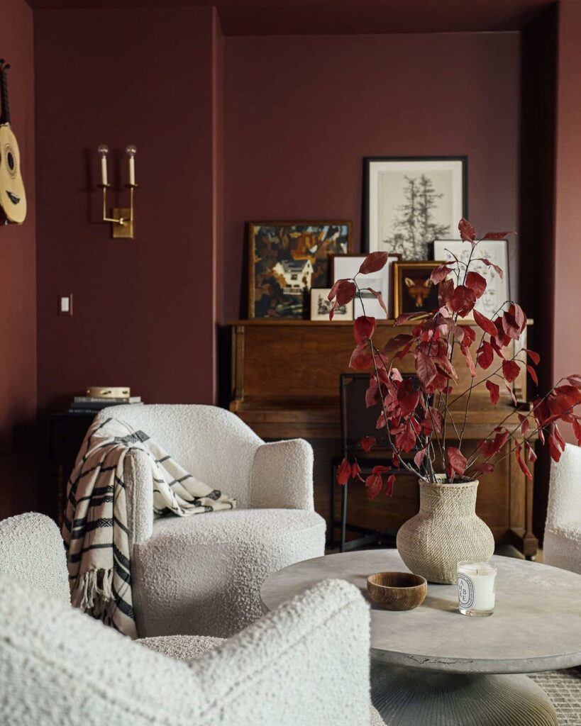
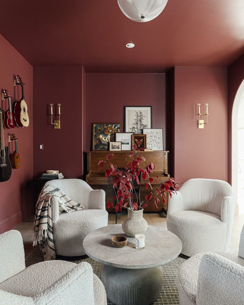
Benjamin Moore Fading Twilight – Muted yet balanced undertones that go from brick to violet make this an essential red.
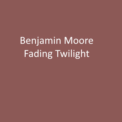
A deep dark burgundy with rusty brownish undertones paint color that extends from the walls to the ceiling creates a cocoon style environment in this living room. Via chrislovesjulia.
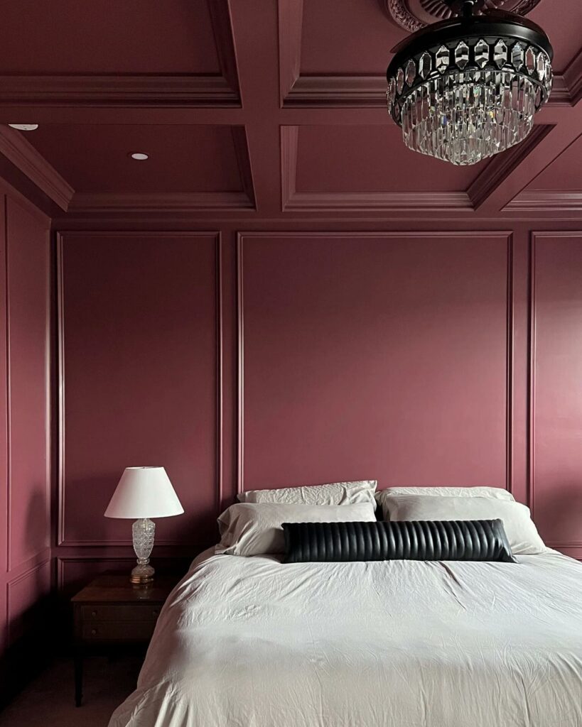
Benjamin Moore New London Burgundy – A distinguished, deep red with violet undertones.
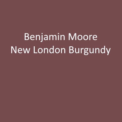
Coffered ceilings and walls painted in this moody burgundy paint color. Via @ouraesthetic_abode.
Trending Grey Paint Colors
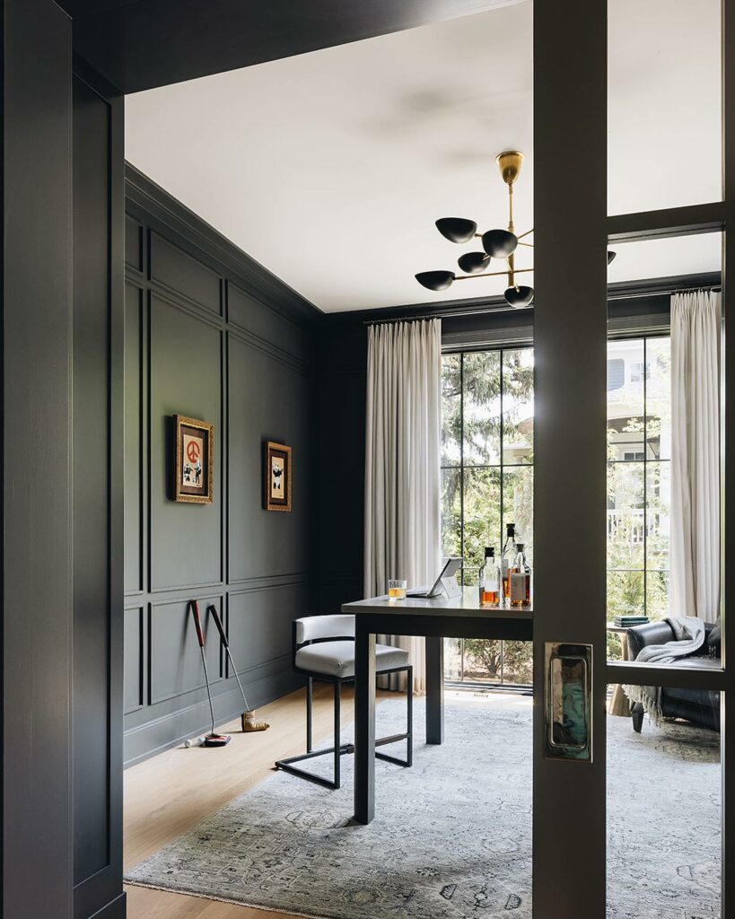
Benjamin Moore Deep Space – A hint of blue defines this lighter shade of black.

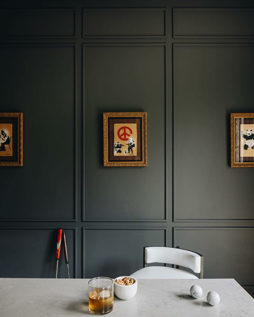
How do you capture the coolest Banksy art in a home office? Give it the perfect background.
We clad these walls in applied molding and painted them top to bottom in Benjamin Moore Deep Space 2125-20, regal matte finish.
Paint Color Discussions: Questions and Answers
Question: So, I’ve been contemplating between Benjamin Moore’s Golden Orchards yellow paint and their regular Yellow. I’m leaning towards Golden Orchards, but I’d love to hear some opinions. Anyone here used either of these yellows?
Mandy: I recently painted my kitchen with Benjamin Moore’s Golden Orchards, and I’m loving the warmth it brings. It’s not too overpowering, and the subtle undertones really make the space feel inviting.
Leonie: Interesting choice! I was eyeing Benjamin Moore Yellow for my living room. What made you go for Golden Orchards over the regular Yellow? I’m curious about the differences.
Mandy: Well, I wanted a yellow that felt rich and had depth without being too intense. Golden Orchards seemed to strike that perfect balance. It’s like a warm, golden hug for the room.
Kiki: I’m in the same boat, considering a yellow for my home office. I’m drawn to the idea of a warm and inviting space. Does the Golden Orchards yellow feel more versatile, or is it just for specific rooms?
Mandy: I’d say it’s pretty versatile. It works great in my kitchen, but I can imagine it lending a cozy vibe to a home office too. The key is balancing it with the right furnishings and decor.
Dan: I’ve always been a fan of a classic yellow, but this Golden Orchards is catching my eye. Any noticeable differences in terms of how they hold up over time? Durability is a big factor for me.
Mandy: Good point! So far, Golden Orchards has held up really well. No signs of fading or wear, and it’s been a few months. Plus, Benjamin Moore’s quality is generally top-notch.
Dan: I’m thinking of a yellow for my front door, and now I’m torn between the two. Is Golden Orchards too bold for a front entrance?
Mandy: Not at all! It could actually make a stunning entrance. Pair it with crisp white trim, and you’ll have a welcoming, cheerful entryway. It’s bold but in a friendly way!
Have any questions, please comment below.