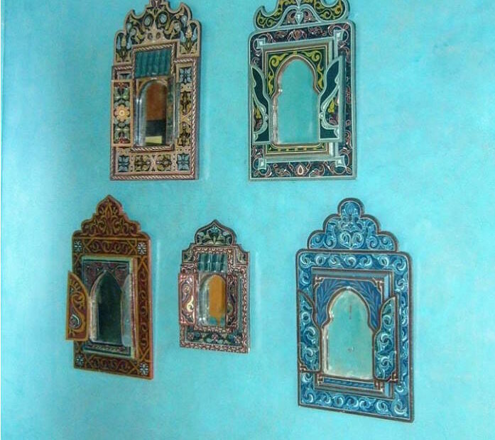
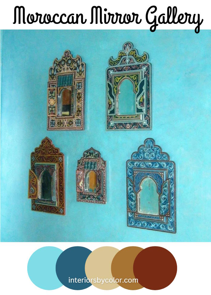
“Vintage Moroccan mirrors with intricate details installed on an accent wall to make the Moorish design even stand out a little more on this polished plastered wall done by @maisoninteriorsbh“
Okay, let’s talk about this stunning concept! As your friendly interior designer and color specialist, I am absolutely thrilled by the vision of a Moroccan mirror gallery on a polished plastered wall in a fresh turquoise paint color. It’s a design that’s both globally inspired and incredibly chic.
First off, that polished plaster wall is a genius move. The smooth, almost luminous surface acts as the perfect backdrop for the rich textures and colors that Moroccan design brings to the table. It’s like a blank canvas that’s already got a touch of sophistication – a wonderful starting point!
Vintage Moroccan Mirrors!
Now, let’s delve into the stars of the show: those vintage Moroccan mirrors! The intricate detailing, often featuring hand-carved wood, bone inlay, or metalwork, is what truly makes them special. We’re not just talking about functional objects; we’re talking about pieces of art that carry stories and traditions. And by curating them into a gallery, we’re not just decorating, we’re creating a conversation.
The color palette you’ve chosen – blue, orange, beige, green, and dark red – is absolutely spot-on for a Moorish-inspired design. Let’s break it down:
- Blue: This is a classic Moroccan hue, reminiscent of the sky and sea. It brings a sense of calm and serenity, and in this gallery, likely provides a cool contrast to the warmer tones.
- Orange: The warmth and vibrancy of orange are quintessential to Moroccan style. It’s an energetic color that adds a welcoming, almost sun-kissed feel to the space.
- Beige: This provides a grounding neutral tone to the mix. It’s the soothing canvas that allows the other vibrant colors to shine without overwhelming the eye, and it ties in beautifully with the neutral quality of the plastered wall.
- Green: Often associated with the lush gardens and vegetation of Morocco, green introduces an element of nature and growth. It’s a refreshing and harmonious addition to the palette.
- Dark Red: Deep, rich red, like burgundy or terracotta, is another common Moroccan color that brings a touch of opulence and drama. It adds depth and gravitas to the gallery.
Why this works so well:
- Textural Contrast: The smoothness of the polished plaster against the intricate details of the mirrors creates a delightful contrast that keeps the eye engaged. It’s a visual feast of matte against sheen, smooth against ornate.
- Color Harmony: Despite the variety of colors, they all share a certain earthiness and warmth, which makes them work together seamlessly. It’s a palette that feels both vibrant and grounded.
- Global Sophistication: The Moroccan style is timeless and inherently luxurious. This gallery doesn’t just decorate a wall; it elevates the entire room, lending it a touch of wanderlust and worldly elegance.
- Statement Piece: The mirror gallery will undoubtedly become a focal point in the room. It’s a captivating display that draws attention and invites closer inspection.
A Few Tips as We Move Forward:
- Layout: Consider a variety of sizes and shapes for the mirrors to add visual interest to the gallery wall. The arrangement can be symmetrical for a more formal look or asymmetrical for a more relaxed, bohemian vibe.
- Lighting: Make sure to highlight the mirror gallery with appropriate lighting. This can be done through spotlights, wall sconces, or even strategic use of natural light to really showcase the reflections and details.
- Don’t Be Afraid to Mix: While this is a specific color scheme, feel free to mix in a few other small details that fit with the Moorish inspiration, such as smaller ceramic pieces or a woven wall hanging.
Overall, this is a brilliant concept that combines rich history, artistic detail, and a balanced color palette. It’s a design that’s sure to be both beautiful and meaningful.
