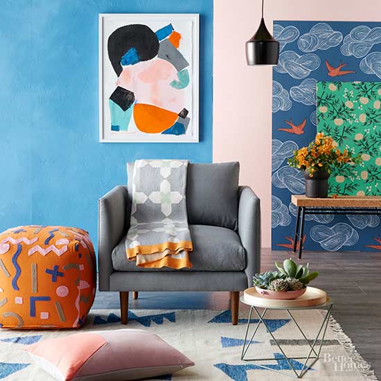
BHG’S 2016 Color Palette of the Year:
“This year’s palette is downright upbeat. Don’t worry — not the exuberant, jumping-on-the-couch kind of happy. It’s more like the kind of happy where your glass is half-full with an Aperol spritz and your current view is of the ocean. Who’s in?”
A palette is like one big, happy family — each color is strong on its own, but they’re even more amazing together.
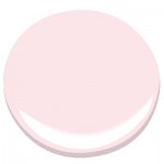
PINK
Finally, a pink that isn’t too saccharine. “It’s feminine, of course, but so sophisticated and amazing as a neutral when paired with blues, blacks, and metallic accents,” says Khristian A. Howell, designer and color expert. Gentle Blush 2084-70 Benjamin Moore
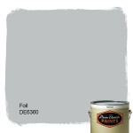
GRAY
The popular new kid on the color block isn’t going away any time soon. This cool, muted gray can look both classic and contemporary. Foil DE6360 Dunn-Edwards
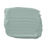
BLUE
Other colors in the palette almost bounce off this midtone blue, giving it a big, gregarious personality. Smoke Blue PPG451-5 Pittsburgh Paints
GREEN
A hint of silver makes this green stand out. “It’s a throwback to the greens used in 1950s kitchens,” says interior designer Paige Sumblin Schnell. “It has a modern-retro vibe, which I love.” Smoke Bell RL1599 Ralph Lauren Paint
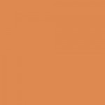
ORANGE
Everyone’s crushing on this energetic orange. “It’s like a kiss,” says Kate Smith, designer and color expert. “It can be a comma, a question mark, or an exclamation point.” Tango 6649 Sherwin-Williams
“What’s the secret to color happiness? In a word: balance. This year’s palette is a yin and yang of vibrant and calm, cool and warm, rich and not-too-sweet. The steely blue is gutsy but congenial — it plays nicely with everything. Blush pink and minty green are as soft and comfy as a favorite blanket, but all grown up. And those little zings of orange are like moments of pure joy — small and fleeting, but they energize everything they touch.”

