Bright & Airy Transitional Farmhouse Kitchen with Vaulted Ceiling & Skylights.
This kitchen is a masterclass in creating a bright, welcoming, and functional space that seamlessly blends classic and contemporary elements. It’s a perfect example of how to bring the outdoors in, use a neutral color palette with subtle pops of color, and incorporate natural materials to create a timeless and inviting kitchen. The attention to detail, from the architectural features to the decorative accents, elevates the space and gives it a truly luxurious feel. It’s a kitchen that’s both beautiful to look at and a joy to use.
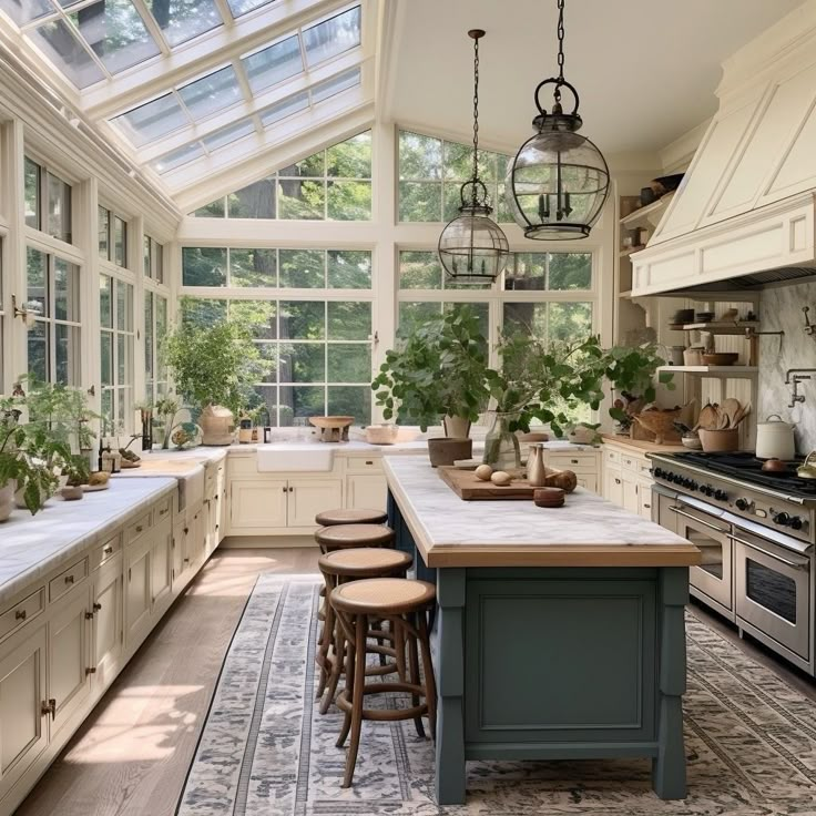
Overall Style and Ambiance:
This kitchen exudes a bright, airy, and sophisticated feel, best described as a blend of Transitional and Modern Farmhouse styles, with a touch of European Country influence. The space feels connected to the outdoors, almost like a conservatory kitchen, thanks to the abundance of natural light.
Key Design Elements:
- Architectural Features:
- Vaulted Ceiling with Skylights: The dramatic vaulted ceiling, punctuated by large skylights, is the defining feature. It floods the space with natural light and creates a sense of grandeur.
- Extensive Windows: The walls are almost entirely composed of multi-paned windows, blurring the line between indoors and out. The window frames are a classic, understated design, painted in a soft white that complements the overall color scheme.
- Shiplap Hood: Above the range is a custom range hood with vertical, that blends farmhouse with elevated.
- Open shelving: To the right of the stove, is an open shelve, that houses many cooking and decorative pieces.
- Color Palette:
- Soft, Neutral Base: The primary color is a creamy, off-white (almost a pale greige) used on the cabinetry and walls. This creates a serene and timeless backdrop.
- Warm Wood Tones: The hardwood floors are a light, natural oak, adding warmth and organic texture. The barstools and some countertop accessories introduce darker wood tones, providing contrast.
- Muted Blue-Green: The kitchen island is painted in a beautiful, muted blue-green shade. This adds a touch of color without overwhelming the space, and it complements the greenery brought in by the plants.
- Marble Accents: The countertops and backsplash appear to be a light-colored marble, likely Carrara or Calacatta, adding a luxurious and classic touch.
- Cabinetry and Hardware:
- Inset Cabinetry: The cabinets are likely custom-made, with an inset design. This means the doors and drawers are flush with the cabinet frame, creating a clean, tailored look.
- Simple, Elegant Hardware: The cabinet hardware is understated, likely polished nickel or a similar finish, adding a touch of sophistication.
- Farmhouse Sink: A large, white farmhouse-style sink (also known as an apron-front sink) is a key element of the Modern Farmhouse aesthetic.
- Island and Seating:
- Contrasting Island: The island provides a visual focal point, with its contrasting color and substantial size. It offers ample workspace and seating.
- Woven Barstools: The barstools have a classic design with woven seats and backs, adding texture and a touch of rustic charm.
- Lighting:
- Pendant Lights: Two large, glass globe pendant lights hang above the island. They have a vintage-inspired design with metal accents, providing both ambient and task lighting.
- Natural Light: The abundance of natural light is a key element, reducing the need for artificial lighting during the day.
- Decorative Accents:
- Abundant Greenery: Potted plants of varying sizes are strategically placed throughout the kitchen, bringing life and a connection to nature.
- Neutral Rug: A large, patterned rug in neutral tones anchors the space and adds warmth underfoot. The pattern appears to be a traditional or vintage-inspired design.
- Curated Accessories: Cutting boards, ceramic bowls, and other kitchen accessories are thoughtfully displayed, adding personality and a sense of lived-in elegance.
Pain Colors for this Kitchen
For the Creamy Off-White Cabinets:
The cabinets appear to be a warm, soft off-white, not a stark or cool white. It has slight yellow/beige undertones, which contribute to the kitchen’s warm and inviting feel. Here are some good matches from major paint brands:
- Benjamin Moore:
- Simply White (OC-117): This is a very popular, versatile off-white. It’s clean and bright but has enough warmth to prevent it from feeling stark. It’s a great starting point.
- White Dove (OC-17): Another highly popular choice, White Dove is slightly softer and creamier than Simply White. It has a subtle gray undertone that keeps it from being too yellow.
- Swiss Coffee (OC-45): This is a warmer off-white with more noticeable beige undertones. It would be a good choice if you want a slightly cozier feel.
- Navajo White (OC-95): This is a classic, creamy off-white that’s even warmer than Swiss Coffee. It might be a good match if the lighting in your own kitchen is cooler, as it will help balance that out.
- Sherwin-Williams:
- Alabaster (SW 7008): A very popular, soft, warm white. It’s similar to Benjamin Moore’s White Dove.
- Creamy (SW 7012): As the name suggests, this is a creamy off-white with yellow undertones.
- Aesthetic White(SW7035). A white with a beige undertone.
- Shoji White (SW 7042): A warm, grayish-beige white. It has more depth than Alabaster and would work well if you want a slightly more “greige” look.
For the Muted Blue-Green Island:
This color is more complex. It’s a muted, grayed-down blue-green, with a sophisticated, almost vintage feel. It’s not a bright or saturated color.
- Benjamin Moore:
- October Mist (1495 / CC-550) 2022 color of the year: A muted, gray sage green.**
- Quiet Moments (1563): A soft, calming blend of blue, green, and gray.
- Gray Cashmere (2138-60): This is a very light, grayed-out blue-green. It might be a good match if you want a very subtle color.
- Palladian Blue (HC-144): A more saturated blue-green, but still muted and elegant. You might need to lighten it slightly to match the image perfectly.
- Sherwin-Williams:
- **Evergreen Fog (SW 9130) 2022 color of the year: A green-meets-gray, with just a hint of blue.
- Sea Salt (SW 6204): A very popular, light, grayed-out green. It’s more green than blue, but it has a similar calming effect.
- Rainwashed (SW 6211): A bit more blue than Sea Salt, but still soft and muted.
- Oyster Bay (SW6206): a mid-tone gray-green.