Haymes Paint Colour Palettes. Embrace Colour Library Volume 18.
“With a set of three unique colour palettes: Calm Mind, Happy Home and Grounded; our Embrace Colour Library features hues that combine the concepts of joy and youthfulness. Wendy Rennie, Haymes Colour and Concept Manager, says that “these palettes have been put together to provide colour combinations that offer not just notions of aesthetic beauty, but also capture certain sensibilities of ‘groundedness’, tranquility and energy to embody themes that are more relevant today than ever before”.”
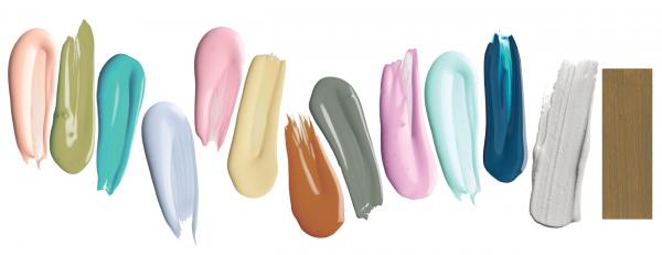
Calm Mind
Despite what is going on in the world around us, by looking inwards we can find an innate sense of calm and peace. Our new normal is to find ways to relieve stress within the environments we can control and have access to, as well as discovering ways to promote self-care. The Calm Mind palette does just this by inspiring mental wellbeing through colour.

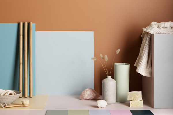
Haymes colours used: back wall ‘Pale Rust’, ‘Chinoserie’ and ‘Crystal Clear’.

Diving deeper into the colours the soothing tones of creamy green and blue with muddied peach, pink and rusts create a tranquil fusion of colour that nurtures the mind and soul.


Haymes colours used: Image 1 back wall ‘Pale Rust’ and floor ‘Shell Pink’. Image 2: back wall ‘Remote’.
The Calm Mind palette offers the basis for a calming atmosphere. Emulating the nurturing look and feel of a luxe spa retreat in your own home. Something we all need a little more of in our lives.
Happy Home
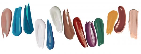
The Happy Home palette encapsulates a relaxed approach to interiors by offering an uplifting array of tones and hues that work to encourage joy. This palette is all about bringing in youthful design elements into your home and injecting energy into spaces to refresh your senses.


Haymes colours used: Image 1 . Image 2 ‘Light Buff’, ‘Humas’ and ‘Middle’. Image 3 ‘Pod White’ and ‘True Self’.
Bold blues, rusty reds and pops of bright yellow bring a sense of fun and hope back into our homes. The palette inspires interiors that are characterised by quirky styling, bold colour blocking and a smack of zesty exuberance.
Grounded
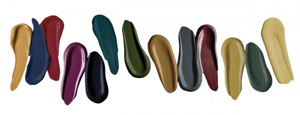
The Grounded palette draws inspiration from the earthy tones of the natural world, offering an escape from the artificial light of our screens and devices to bring us back to the present.


Haymes colours used: ‘Immersive Blue’, ‘Sand Haze’, ‘Contrast’ and ‘Moment’.
Deep tones of ink blue and warm sandy neutrals with olive greens emulate the calming force of the ocean, earth and forest. These colours remind us that we can create spaces within our home that reinforce our connection to the land and provide a sense of “groundedness” neutralising the chaos of the outside world and enveloping us in a sense of serenity.

![]()
Haymes colours used: ‘Moment’ and ‘Rubicon’.