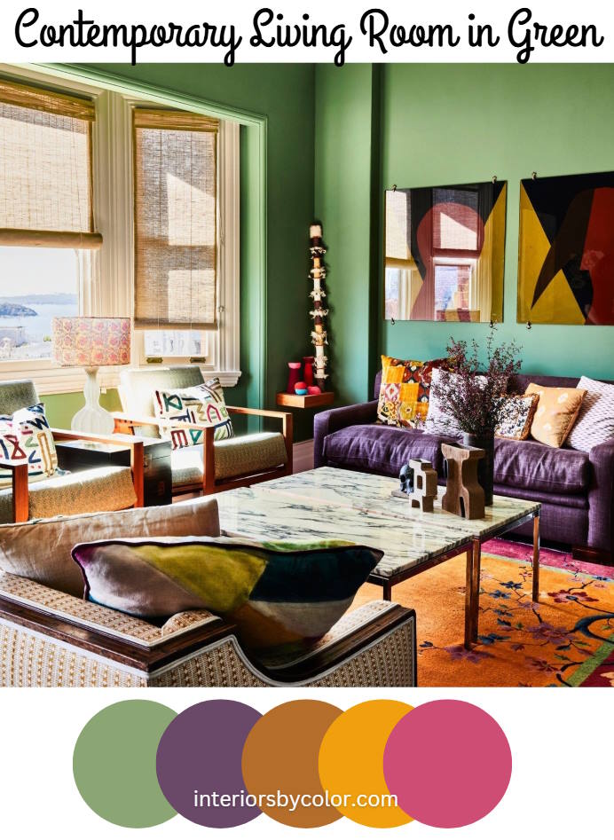
Step into a space where color isn’t just a backdrop, it’s a conversation starter, a burst of energy, a full-bodied experience. Forget timid neutrals – this contemporary living room is an ode to boldness, a celebration of vibrant hues that dance and sing in perfect disharmony. The result? A room that feels as invigorating as it is sophisticated.

The Stage is Set: A Canvas of Opaque Green
Our journey begins with the walls, painted a medium opaque green. This isn’t your grandma’s pastel green; it’s a deeply saturated, almost verdant tone that provides both depth and vibrancy. Think lush forest foliage, but with a slightly softened edge. It’s a choice that feels both grounded and adventurous, offering a dynamic background that makes other elements pop. It avoids a washed-out look that some lighter shades of green risk and is a very current style choice.
The Purple Reign: A Statement Sofa
Seating is key to any living area and that takes centerstage. Instead of playing it safe, the room features a purple sofa, the epitome of unexpected chic. The deep, velvety hue offers a striking counterpoint to the surrounding greens, making it the room’s anchor and the focus. The choice speaks of confidence, an assertion that color is meant to be enjoyed without constraint. It has also the added element of a comfortable color for relaxing and the softness associated with this texture creates a sophisticated visual texture against the surrounding materials in the space.
Abstract Expression: A Bold Artistic Counterpoint
Leaning against one of the richly hued walls or featured above the purple sofa is the space’s conversation starter: Abstract art exploding in shades of red, black, and yellow. This composition acts as an almost controlled explosion within the more calm colors surrounding it and the design reflects a chaotic world contained within it. These are colors that evoke strong emotion. The use of strong colors alongside the neutral black in abstract art can create a focal point within a space, drawing in a viewer’s attention, adding depth, texture, and mood to this space. The art injects a sense of the unconventional into the mix, the chaotic brushstrokes reflecting an approach to design that embraces imperfection and dynamism.
A Floral Fantasy: Orange and Fuchsia Underfoot
Look down and you are immediately drawn into an alternative realm with an orange and fuschia carpet boasting a floral print near the borders. While floral designs might seem traditional to some, this is certainly not your classic wallpaper print. Its bold color palette transforms the usually demure pattern into a work of modern art. The vibrant tones continue to push against conventions and ground the more ethereal art above and are a beautiful textural contrast against the more structured pieces in the room such as the table and sofa. The contrast of cool colors above with this pattern will offer a visual depth.
Nature Meets Contemporary: A Marble Centerpiece
Completing the design with an opulent finishing is a veiny marble coffee table is at the room’s heart. Its smooth surface offers both contrast and an element of elegance amidst all the riotous patterns. It’s where nature meets contemporary design in a statement that perfectly harmonizes within the carefully cultivated vibrancy. This piece is both artful and practical and also brings in an element of grounding to contrast with the above use of patterns.
A Deliberate Dance of Opposites:
This room is not a random collection of color. It’s a deliberately orchestrated symphony, one that revels in the beauty of contrasts. The deep green of the walls grounds the energy of the fuschia and purple elements, while the bright pops of the abstract art bring an element of spontaneity. The bold patterns meet the organic curves of the furniture as everything converges to create a harmonious atmosphere.
The Final Note:
The most intriguing aspect of this living space is not simply the bold use of color, it is the mood this daring arrangement inspires. It embodies a brave departure from safe interiors, opting instead for spaces that ignite conversations and energize its inhabitants. It reminds us that color can be expressive, unexpected and most importantly a whole lot of fun and offers an opportunity to step into the wild and explore color as it comes together to create a complete symphony.
This contemporary living room is not for the faint-hearted; it’s for those who crave vibrancy and celebrate life in full color. It’s an audacious exploration into how fearless use of bold shades, mixed patterns, and daring statements can transform a space into an experience – a testament that living well means living in full color.
Source: House and Garden Mag.
Green Paint Colors:
Okay, here are some green paint color brands and specific names that would be excellent choices for the living room we described, keeping in mind the medium opaque green that would work well with the purple sofa, vibrant art, and patterned carpet. I’ve included a range of options from different brands, along with a little description of each to help you visualize:
Higher-End Brands:
- Farrow & Ball: Known for their richly pigmented, complex colors and eco-friendly formulations.
- Bancha No. 298: A strong, olive green that feels very current. This is a bolder choice but would create a really dramatic and enveloping feel in the room.
- Studio Green No. 93: A deep, almost black-green. Use this if you want a very dramatic, moody, and luxurious look. It would be a stunning contrast with the brighter elements.
- Duck Green No. W55: A strong, characterful green that is welcoming. It is named after the deep green plumage of a mallard.

- Benjamin Moore: A classic and widely respected brand with an extensive color range.
- Cushing Green HC-125: A versatile, mid-tone green with a slightly grayed-out quality. It’s fresh and lively without being too bright and current.
- Backwoods 469: A deeper, forest green that feels very natural and grounding. This would be a good choice if you want a more immersive, nature-inspired feel.
- Tarrytown Green HC-134: An elegant, historical green with a good bit of depth. It has a slightly traditional feel but would work well in a contemporary setting with the right accents.
- Little Greene: A British paint company known for their high-quality, environmentally friendly paints and historical color accuracy.
- Ambleside 304: A deep, muted green that feels very sophisticated.
- Invisible Green 56: A classic green that is easy on the eye, bringing the outside in with its leafy hue.
- Puck 298: A bold, dark green that is sure to add drama to any room, named after the mischievous sprite in Shakespeare’s A Midsummer Night’s Dream.
Mid-Range Brands:
- Sherwin-Williams: A very popular brand with a wide range of colors and finishes.
- Pewter Green SW 6208: A beautiful, gray-green that feels both modern and timeless. It is currently a popular color in design magazines.
- Rosemary SW 6187: A darker, more herbal green with a hint of gray. This is a sophisticated choice that would work well with the purple sofa.
- Ripe Olive SW 6209: A deep, olive green that would make a bold statement.
- Behr: Another widely available and reliable brand.
- Jungle Camouflage N350-5: A mid-tone green that balances between warm and cool tones.
- Equinox N380-6: a balanced mid-tone with equal gray undertones.
Other Considerations:
- Sheen: For a living room, an eggshell or satin finish is generally recommended. These finishes have a slight sheen that’s durable and easy to clean but not overly glossy. Matte finishes can work, but they can be more difficult to maintain in high-traffic areas.
- Undertones: Pay close attention to the undertones of the green you choose. Some greens lean more yellow, while others have blue or gray undertones. Hold the paint swatches next to your fabric samples (purple sofa, carpet, artwork) to see how they work together.
- Lighting: Always test paint colors in the actual room where you’ll be using them. Natural and artificial light can significantly affect how a color appears. Paint large swatches on different walls and observe them throughout the day.
My Personal Recommendations for This Room:
For the living room we’ve envisioned, I’d lean towards these colors:
- Farrow & Ball Green Smoke or Bancha: For a high-end, luxurious, and dramatic look.
- Benjamin Moore Cushing Green: For a versatile and balanced green that will work well with a variety of styles.
- Sherwin-Williams Pewter Green or Rosemary: For a sophisticated and slightly muted green that won’t clash with the bolder elements.
Ultimately, the best green for your living room will depend on your personal taste and the specific nuances of your space. I strongly encourage you to get samples of a few different shades and test them out before making your final decision. Good luck, and have fun with it!