With so many great light blue paint colors to choose from, it is hard to decide on one! Light blue is a great paint color for kitchens, bedrooms, bathrooms and living rooms. They provide you with a serene, cool and elegant ambiance. These paint colors are very peaceful, some of theses blue paint colors are barley-there, some are soft muddy blues, some blues have grey in them, others have a tendency towards green, all are stunning.
Blue is a favorite color for many people, it signifies honor, strength, dependability and loyalty. Pale and light blues in particular are zen-like, tranquil colors that look fantastic when paired with white trim. These blues are a great choice because they are subtle, almost like a neutral and they don’t overwhelm a space.
Pale Blue/ Light Blue Paint Colors for 2020
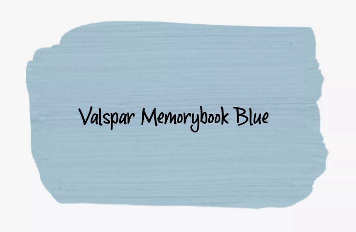
Valspar Memorybook Blue 4007 5C is a soft and peaceful shade of light blue paint color that can work as a neutral in large doses. This hue is calming, creating a great foundation for a den or study.” The muted shade of blue also works well as a kitchen wall color alongside white cabinetry and shiny fixtures and finishes. A blue with very cool and pale undertones.
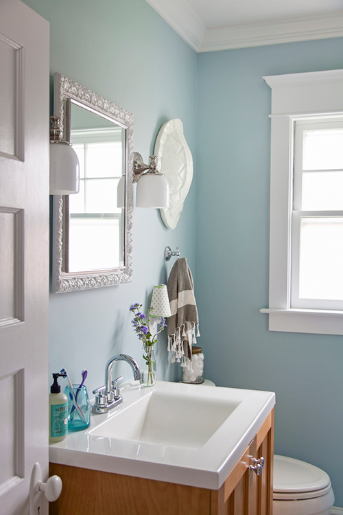
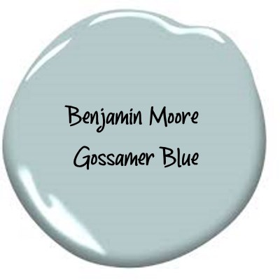
Bathroom walls painted in Benjamin Moore Gossamer Blue. A timeless mid-tone that’s soft and subtle, gossamer blue evokes the mellow, relaxed feeling of faded blue jeans and lazy summer days. Via Design Sponge.
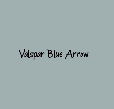
For your bedroom, try a soothing shade of blue, like Valspar Blue Arrow, a versatile color that calms without being boring. “Easy on the eye, easy to live with. It’s a robin’s egg blue-green with a bit of muddiness to it,” says Melissa Birdsong, Lowe’s vice president of trend design and brand. “I always like my colors a little muddy.” Blue is a popular wall color because it goes with almost any wood tone.
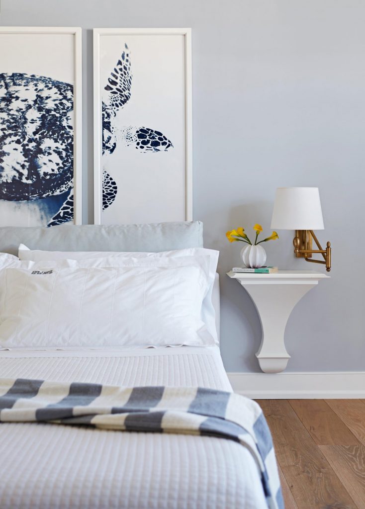
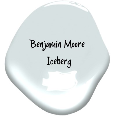
Benjamin Moore Iceberg is a great choice for master bedrooms when you are looking for soothing and calming shade of blue, that is crisp and serene all at once.
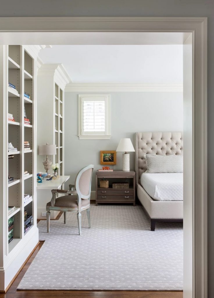
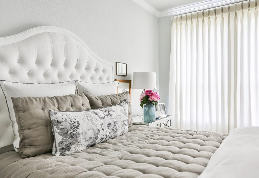
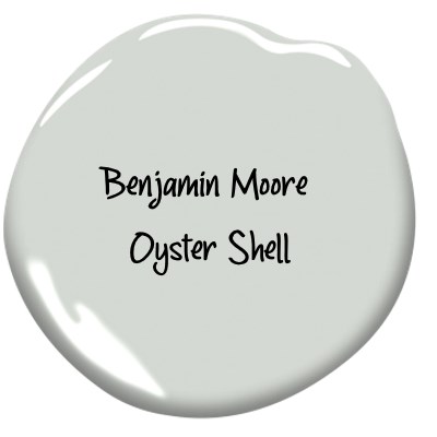
Benjamin Moore Oyster Shell is a peaceful, barley there blue paint color, it has an instant soothing affect that makes it great for bedrooms. Via BH&G
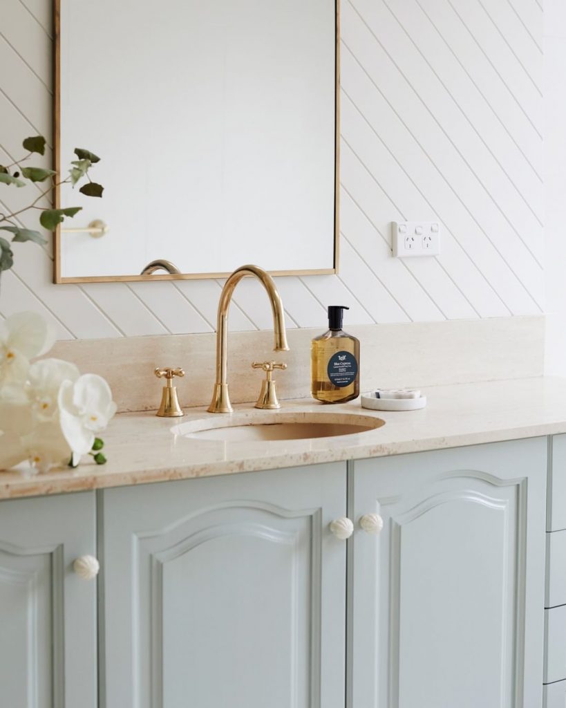
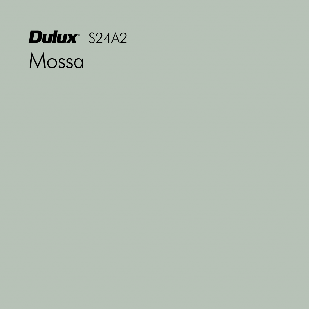
Dulux Mossa makes cabinetry pop without overpowering the benchtop or walls. This palette is fresh and light with a touch of added decadence. via @threebirdsrenovations. This pale muddy blue has green undertones, it is a fantastic blue that works just like a neutral, it is easy to the eye.
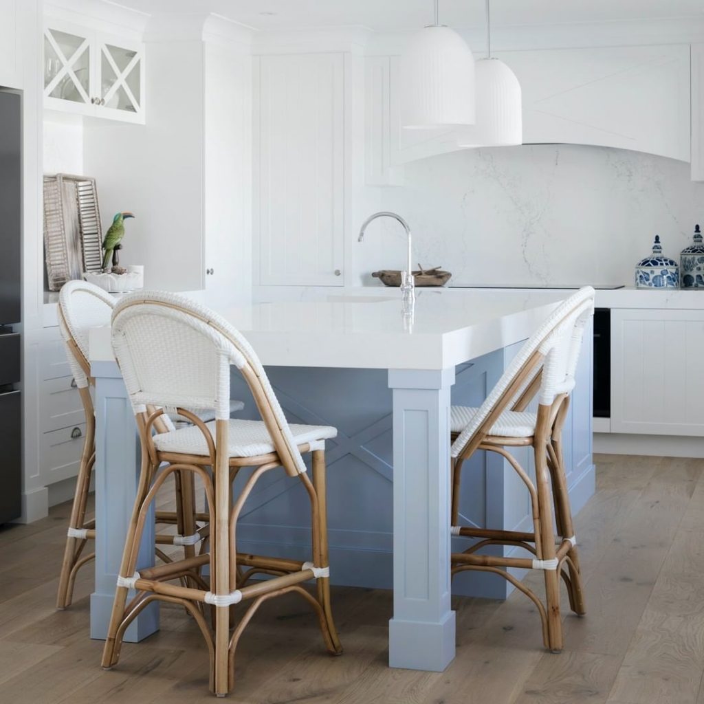
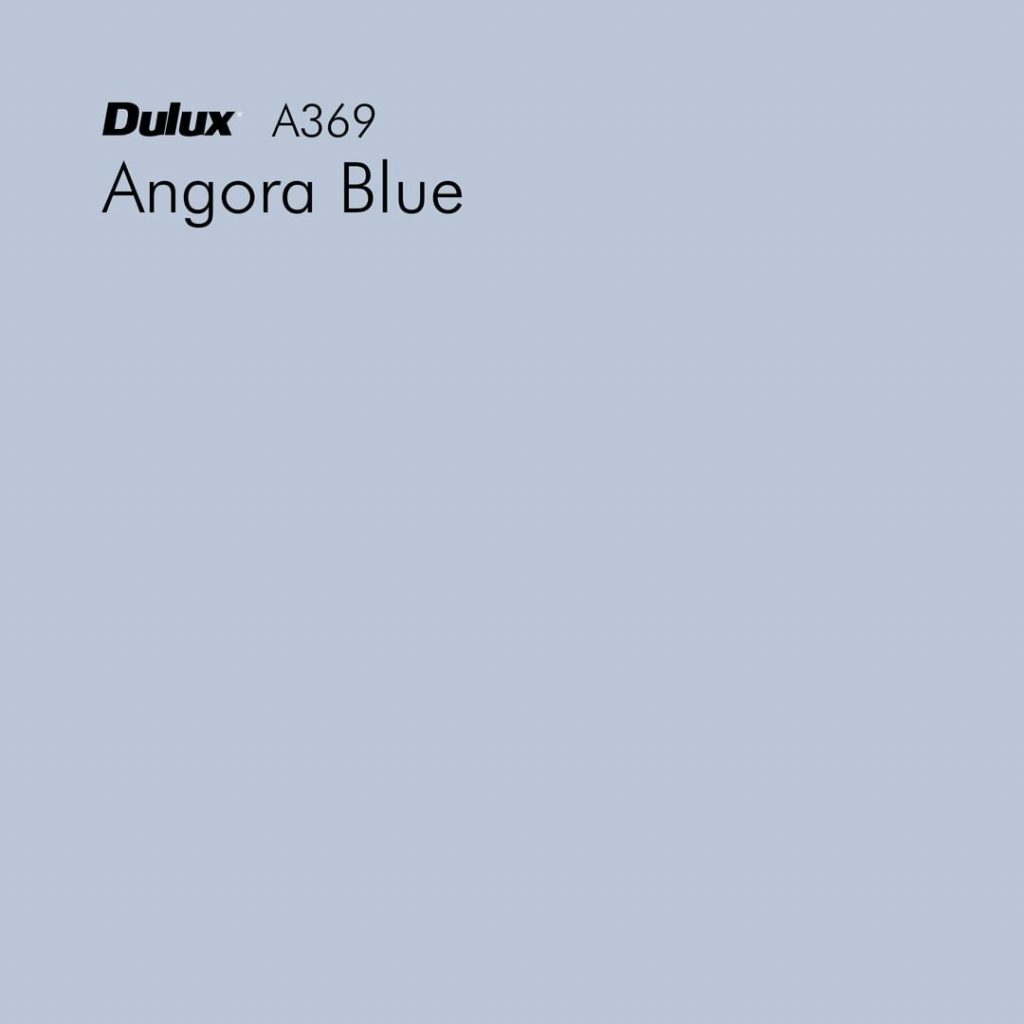
This v-groove wood panelling is a stylish addition to the House 11 kitchen by @threebirdsrenovations. A splash of Dulux Angora Blue softens the stone and introduces a sense of unexpected coastal charm.
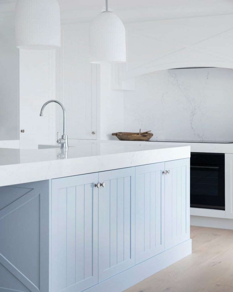
White and blue kitchen painted in light blue Dulux Angora Blue.
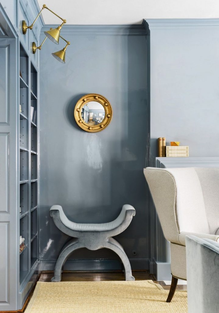
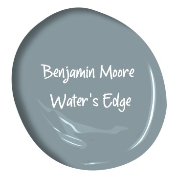
A pale and icy blue like Benjamin Moore’s Water’s Edge 1635 os a blue that brings clear skies indoors. The study below is a great example of this with a high-gloss lacquer for a mirror-like finish.
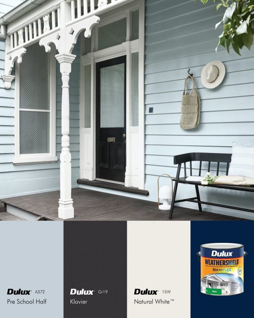
Transform your verandah this summer and make an impression from the moment your guests arrive. Lighter shades are great for highlighting features like fretwork and windows, while deeper colours create a beautiful contrast. Colours featured in this exterior are Dulux Pre School Half, Dulux Klavier and Dulux Natural White. Via breeleech davidmitchenerphotographer.
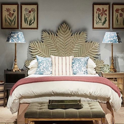
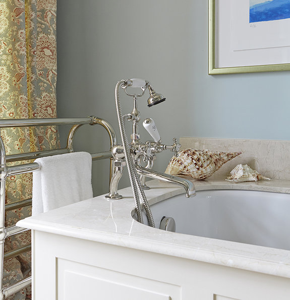
Edward Bulmer Paints Fair Blue. Blues do not need to be cold. It’s all about the pigment mix and ‘Fair Blue’ is a fine example of one of @edward_bulmer soft blues which looks wonderful with whites giving them a Scandinavian clarity.
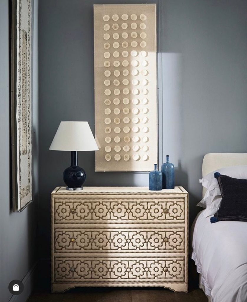
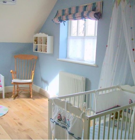
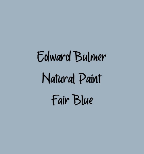
Edward Bulmer Natural Paints Aerial Tint. We pass from grey to blue with this subtle shade. It evokes the distant sky, but let’s face it, an English sky. Based on Prussian Blue but, as with so many of our blues, anchored with yellow ochre to give it a softness and avoid it being too cool.

The joinery in the boot room was painted in Farrow & Ball’s ‘Claydon Blue’ to tone with walls in ‘Oval Room Blue’. Via
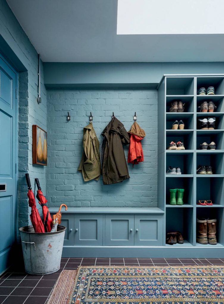

Farrow & Ball Claydon Blue 
Farrow & Ball Oval Room Blue

