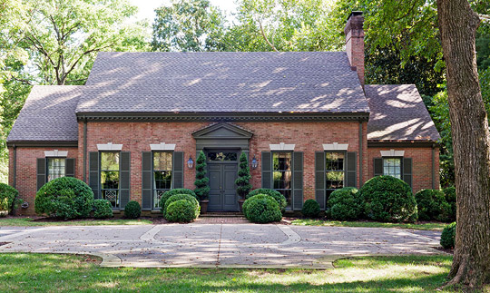
Being an interior designer has certain perks. You’re given access to the best auctions and trade shows. Granted sneak peeks at the latest furnishings and fabrics. And, most important, you have the advantage of a prescient and discerning design eye-the ability to walk into a house and see past its glaring design flaws to the potential beyond. Designers see not the ’70s wall-to-wall shag carpet but the wood floors that lie hidden beneath it. They notice not the dated pine-paneled walls but the mohair upholstery that will soon camouflage them.
It’s this vision that designers Ann Shipp and Roger Higgins (owners of R. Higgins Interiors) called upon when they stumbled across a 1970s Williamsburg-style home in Nashville, Tennessee. “We bought it from the woman who built it in 1970,” remembers Roger. “It was in great shape, but everything was still as it had been when it was built. The floor plan was excellent, and the details were classic. It just needed some serious design help. Thankfully, outdated doesn’t scare me.”
While respecting the home’s architecture, the personal and professional partners took on the nitty-gritty of a top-to-bottom design overhaul-refinishing floors, concealing pine-paneled walls, and renovating a kitchen that was styled when avocado-green appliances were not just accepted but wholeheartedly embraced.
For consistency and flow, the palette was kept simple. Ceilings throughout the house were painted the same shade of pale blue and contrasted with antique-white trim. Dining room walls were saturated with the same rich bronze hue as doors throughout the house. Chartreuse accents were added as a lively counterpoint.
“I like to use a limited palette,” says Roger. “I start with a couple of colors that act as the framework and then add accents. You should be able to take all of the fabrics and paint colors in your home, throw them in a pile, and they should all look good together.”
Though their design approach is ardently sophisticated, the couple tossed in less-refined elements-intentional hiccups that interrupt the home’s otherwise traditional tendencies. Rich fabrics and family heirlooms act as bedrock but allow for rustic elements-the design version of a dramatic pause. In the living room, unfinished cypress is used for the fireplace wall, disrupting the room’s otherwise classic decor. In the dining room, opulent taffeta and lacquered walls cohabitate with a raw wood plinth supporting a weather-worn bust. “I call it ‘jarring juxtaposition,’?” says Roger. “A beautiful antique paired with a chrome lamp, or taffeta with a sisal rug. The mix keeps things fresh.”
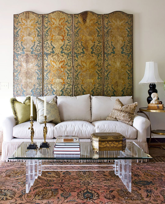
Fabric on green sofa pillow: Beacon Hill, 800/333-3777, beaconhilldesign.com.
Fabric on silver sofa pillow (discontinued): Libas Silk, 800/635-4227, libassilk.com.
Animal-print pillow: vintage.
Screen behind sofa (antique embossed leather screen, purchased at auction); gold side table (antique, esate-sale find); coffee table (estate-sale find): owner’s collection.
Candlesticks on coffee table (antique): Scott Antique Market, scottantiquemarket.com
Roger’s “jarring juxtapositions”—unfinished cypress flooring installed on the wall around the fireplace and woven shades paired with elegant wool curtains—balance the living room’s traditional aspects with casual flair. Blue wool curtain fabric is from F. Schumacher & Co. Shades are from Hunter Douglas.
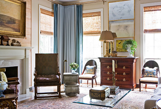
Silk drapery (“Derby” color 160): Taffard Fabrics, 212/213-4670, taffard.com.
Trim (“Lavish Border”/Mineral): Robert Allen, 800/333-3777, robertallendesign.com.
Window shades (“Provenance Woven Wood”/Rustica): Hunter Douglas Window Fashions, 800/274-2985, hunterdouglas.com.
Reclining chairs: antique.
Chair fabric (#NUR04002, discontinued): Zoffany, 800/894-6185, zoffany.com.
End table to left of reclining chair: antique.
Mantel: original to house.
Art over mantel: owner’s collection.
Andirons (antique): Morning Glory Antiques, morninggloryantiques.com.
Wood on mantel wall: clear Cypress.
Area rug: NAR Persian Rugs, 404/351-0093.
Oval-backed chairs by window; pillows on oval-backed chairs; lamp on chest: antique.
Chair fabric: Phillip Jeffries Ltd., 800/576-5455, philipjeffries.com.
Art over chest (by Ally Hughes): ShopSCAD, 912/525-5180, shopscadonline.com.
Walls in the den were upholstered to camouflage dated pine paneling.
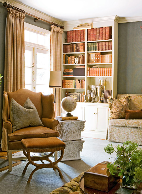
Drapery hardware (Bedpost Collection): Robert Allen, 800/333-3777, robertallendesign.com.
Ottoman/coffee table: The Charles Stewart Co., 828/322-9464, charlesstewartcompany.com.
Ottoman fabric (“Shaldar”/Brown #WI 0001 2000): Old World Weavers, 212/355-7186.
Leather chair by mantel (“Townsend Wing Chair” #1271-55): Hickory Chair, 800/349-4579, hickorychair.com.
Stool in front of chair: antique.
Stool fabric (“Amboise”/Russet): Latimer B. Alexander Inc., 336/889-2531.
Side table beside chair: Preservation Station Architectural Antiques, 615/292-3595, thepreservationstation.com.
Upholstered love seat: Lee Industries, 800/892-7150, leeindustries.com.
Bookcases: original to house.
Area rug: Myers Carpet, 866/450-5551, myerscarpet.com.
Roger bought the etchings of Florence, Italy, at a yard sale. “I love etchings and drawings without color,” says Roger. “They can move easily from room to room.”
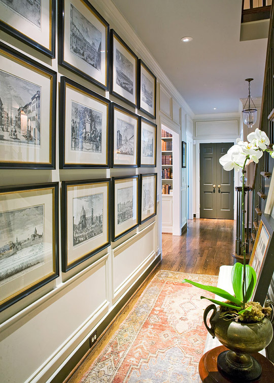
Area rug: Persian Point Rugs, 770/458-9006.
Roger based his decorative wall treatment (he drew it himself) in the hall on a de Gournay wallpaper he used for a client’s project. “I was snowed in and had nothing else to do,” he laughs. “So I just started drawing.”
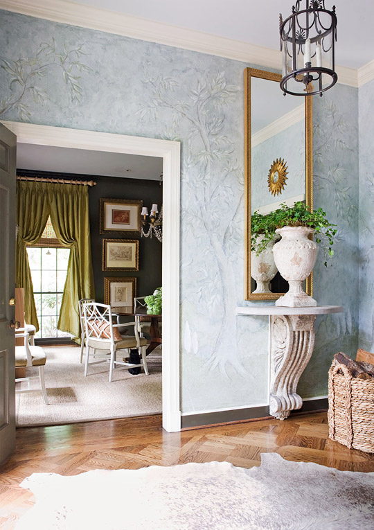
Hanging lantern: original to house.
Mirror (#367032): Larson Juhl, 800/438-5031, larsonjul.com.
Bracket/table under mirror: antique fragments with limestone top.
Area rug: cowhide.
Bronze-lacquered walls set off chartreuse taffeta curtains in the dining room. “I love the contrast between the taffeta, the lacquered walls, and the sisal rug,” says Roger.
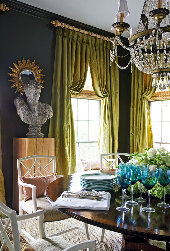
Chairs: antique.
Chair-seat fabric: Highland Court Fabrics, 800/387-2533, highlandcourtfabrics.com.
Pillows on chairs: vintage.
Chandelier (antique): Scott Antique Market, scottantiquemarket.com.
Area rug (Abaca): owner’s collection.
Drapery (“Silk Taffeta”/Pale Gold): Lady Ann Fabrics, 800/282-0961, ladyannfabrics.com.
Wall and trim paint (“Enduring Bronze” #SW7055): Sherwin-Williams, 800/474-3794, sherwin-williams.com.
Ceiling paint (“Limpet Shell” #7064-1): Porter Paints, 800/332-6270, porterpaints.com.
Pedestal holding sculpture (custom): Tim Nance, Nance Furniture, 615/244-9663.
Sculpture: owner’s collection.
Mirror behind sculpture: Elon & Knight Iron, 615/745-5176.
Glassware on table: World Market, 877/967-5362, worldmarket.com.
Plates: McCartys Pottery, 662/748-2293, mccartyspottery.com.
Flatware (“Romance of the Sea”): Wallace Sterling, 800/264-0758, wallacesilver.com.
Cabinets in the kitchen are a color not easily defined. “They’re sort of a yellow-green-gray-putty color,” laughs Roger. “Those colors you can’t describe in one word are the best colors. Everyone sees them the way they want to.”
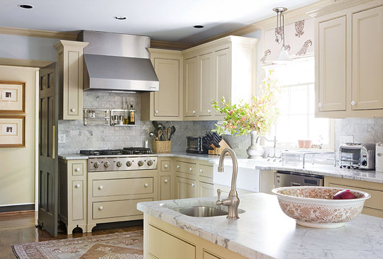
Cabinetry hardware: 1-1/2 inch porcelain knob.
Backsplash tile; countertops: white Venetino marble.
Wall paint (“Limpet Shell” #7064-1); cabinet paint (“Newport Beige” #6897-1): Porter Paints, 800/332-6270, porterpaints.com.
Cooktop (Kenmore Elite); oven hood (Kenmore Elite): Kenmore, 888/536-6673, kenmore.com.
Oven drawers: custom.
Main sink (“Hawthorne Apron-Front Undercounter Kitchen Sink” #K6534-4U): Kohler, 800/456-4537, kohler.com.
Light over main sink: Pottery Barn, 800/922-5507, potterybarn.com.
Area rug: Persian Point Rugs, 770/458-9006.
For a “continuation of color,” Roger chose taffeta curtains that are the same shade of blue as the ceiling. Curtain fabric is from Robert Allen with Samuel & Sons trim.
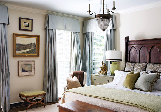
Trim (“2-inch Chambord Braid” #977-17536): Samuel & Sons, 212/704-8000, samuelandsons.com.
Bed (custom, antique kneeling bench with upholstered bed frame); coverlet (Belle Epoque): owner’s collection.
Bed linens: Restoration Hardware, 800/910-9836, restorationhardware.com.
Euro sham (“Judith”/Sage #WF155-001, by Winhall Collection, discontinued): Scalamandré, 800/932-4361, scalamandre.com.
Green blanket: Pottery Barn, 800/922-5507, potterybarn.com.
Chest: antique.
Bedside table (“Bureau” #GUS040): Chelsea Textiles Ltd., 212/319-5804, chelseatextiles.com.
Table lamp: Lumen Lamps, 877/315-2677, lumenlamps.com.
Chandelier; chair beside bed: antique.
Chair fabric: canvas.
Area rug (“Crochet”/Sail): Woolshire Carpets, 800/799-6657, woolshire.com.
Wall paint (“Newport Tint” #6891-1); ceiling paint (“Limpet Shell” #7064-1); trim paint (“Soft Antique White” #6914-1): Porter Paints, 800/332-6270, porterpaints.com.
Walls in the study off the master bedroom are the same pale blue as the ceiling. Trim was painted a darker shade of blue for contrast. The desk and sofa are from Hickory Chair.

Drapery (#31807.160 in Mushroom): Duralee Fabrics, 800/275-3872, duralee.com.
Sectional sofa (“Brooks Sofa” #2802 series); sofa fabric (#HC 2550-12); brown pillows on sofa (#HC 2636-84): Hickory Chair, 800/349-4579, hickorychair.com.
Throw pillows; portrait; art; desk chair (antique): owner’s collection.
Area rug: Woolshire Carpets (“Crochet”/ Sail): Woolshire Carpets
The Williamsburg-style brick house was built in 1970. A wooded lot and creative landscaping add privacy from the busy street.
Photography: Reid Rolls
Interior designers: Roger Higgins and Ann Shipp, R. Higgins Interiors, 2000 Blair Blvd., Nashville, TN 37212; 615/297-9632, rhigginsinteriors.com.
via Traditional Home
